Brother
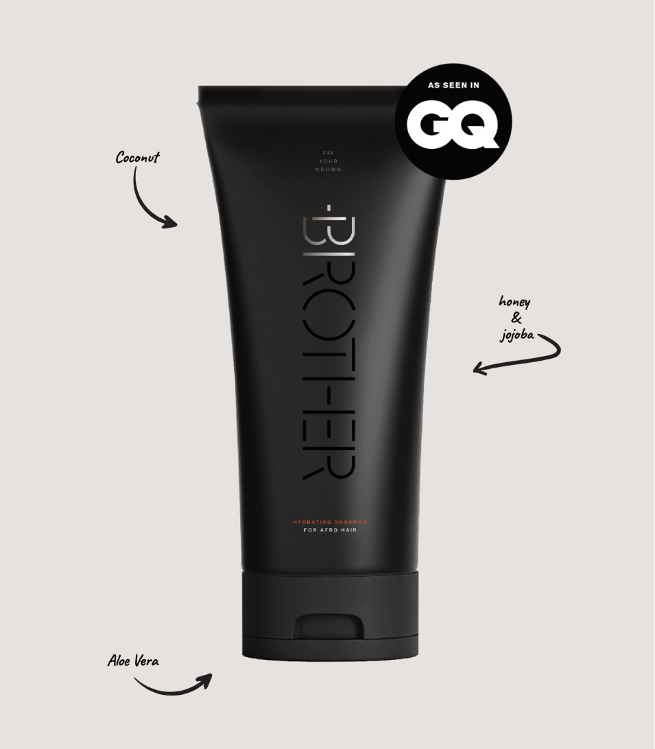
Brother was born out of a gap the category had left open for a long time: haircare products either loaded with harsh chemicals, designed for women, or unchanged in formulation and branding for decades none of them built with black and mixed-heritage men’s hair, or that audience, actually in mind.
The identity is built around a single governing idea: hair as a crown. Not as a slogan sitting over the packaging, but as the organising logic for how the brand presents itself confident, a product of pride.
It’s a brand built from absence everything the shelf wasn’t offering this audience which is usually the strongest brief a studio can get, because the answer only has to be authentically for someone, not for everyone.
Client Brother
Location Not specified
Scope Brand identity · Packaging design · Visual identity system
Sector Haircare and personal care branding