Wildside
A hard soda brewed in Vietnam with local cane sugar and natural flavours, launching into a category where the shelf is already a wall of noise.
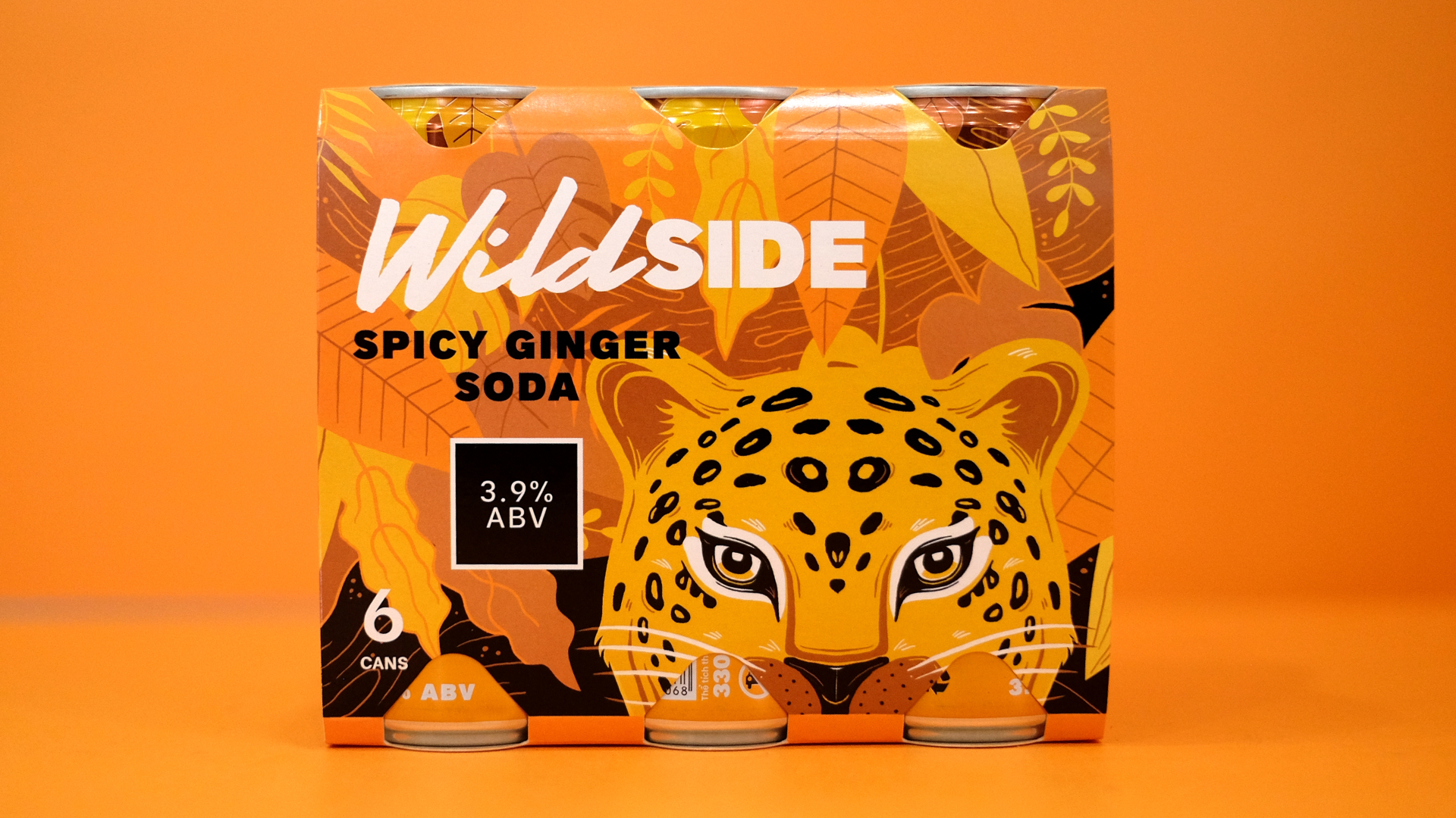
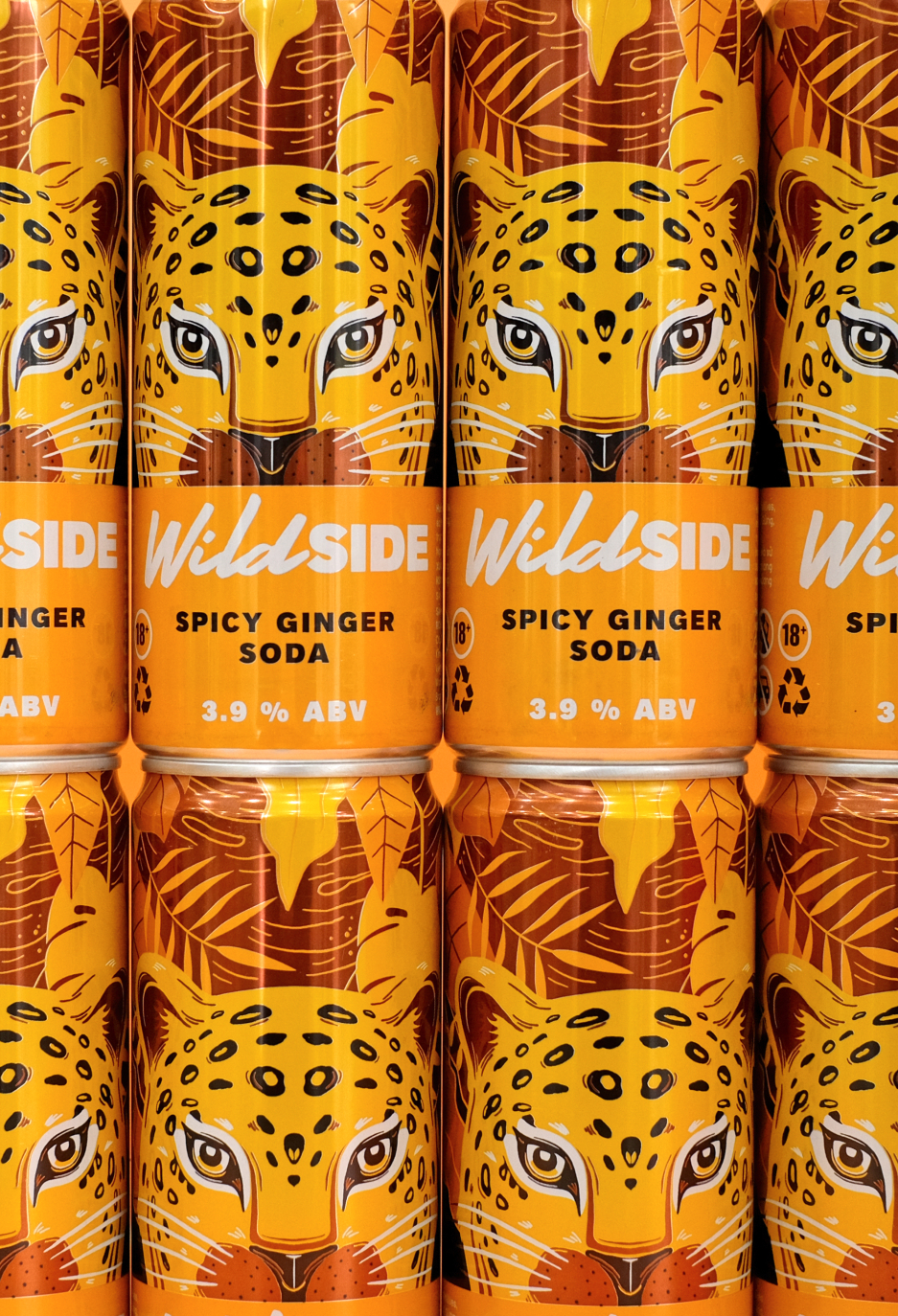
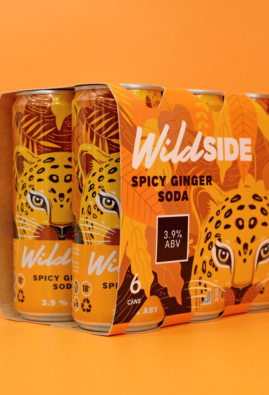
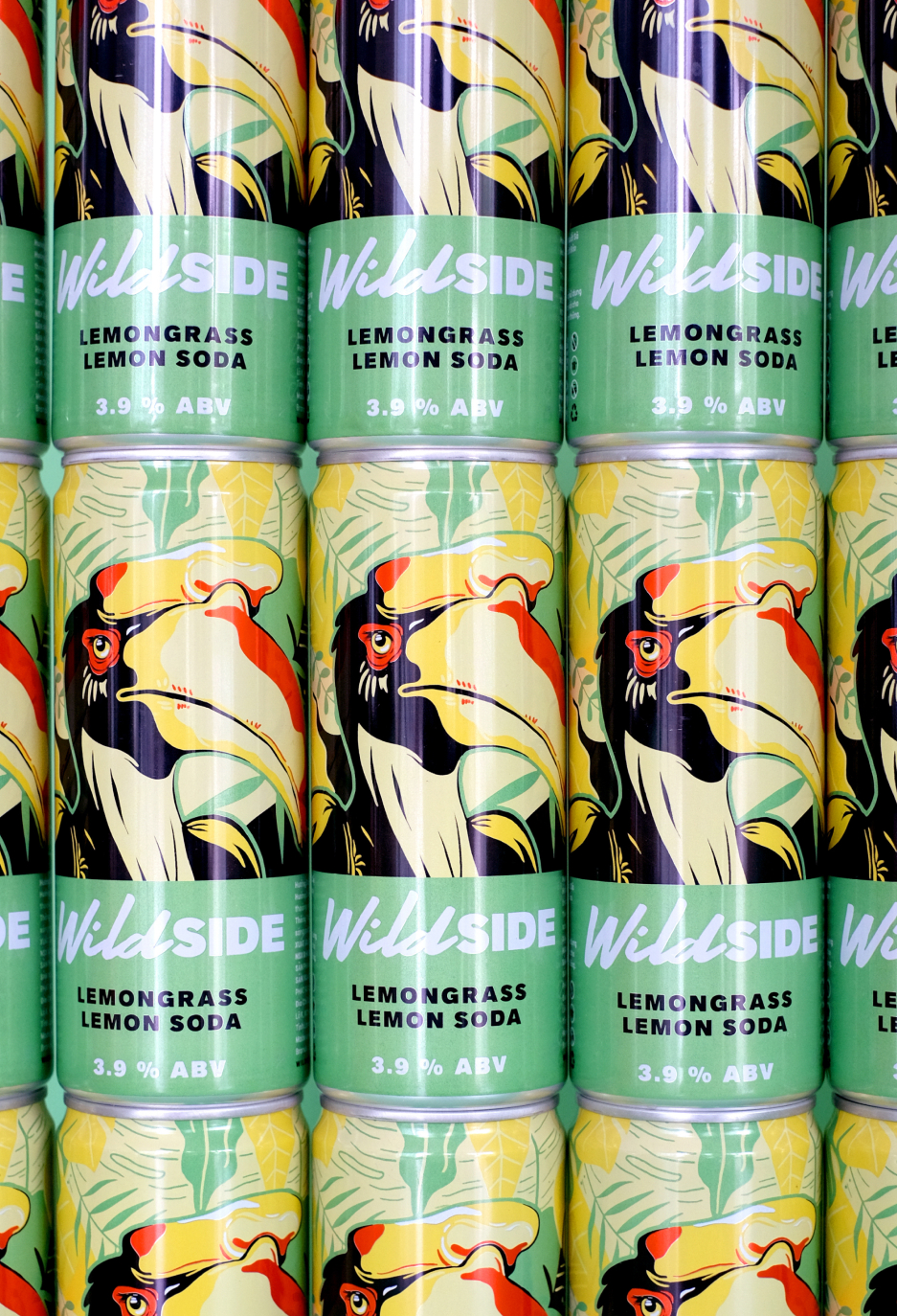
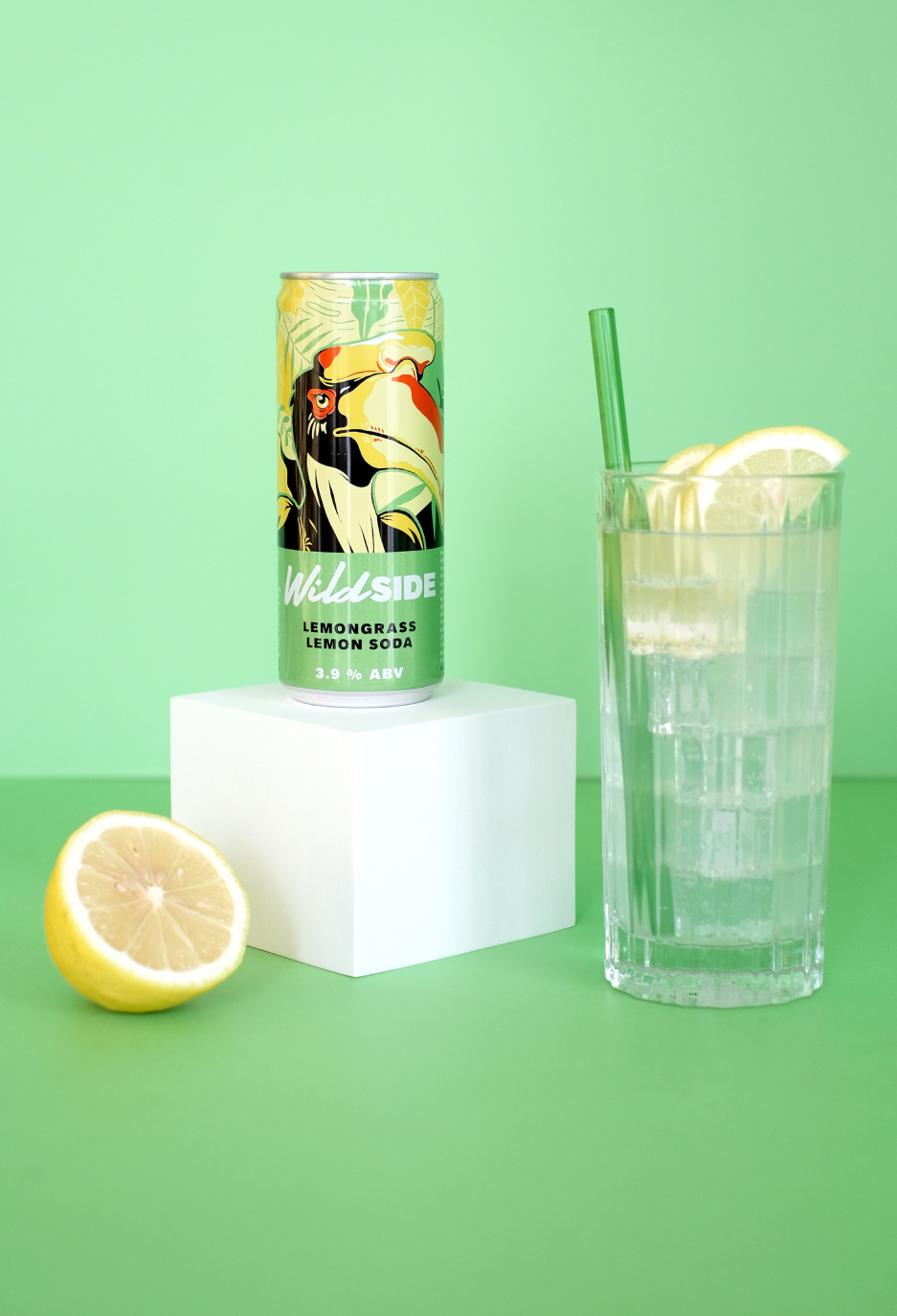
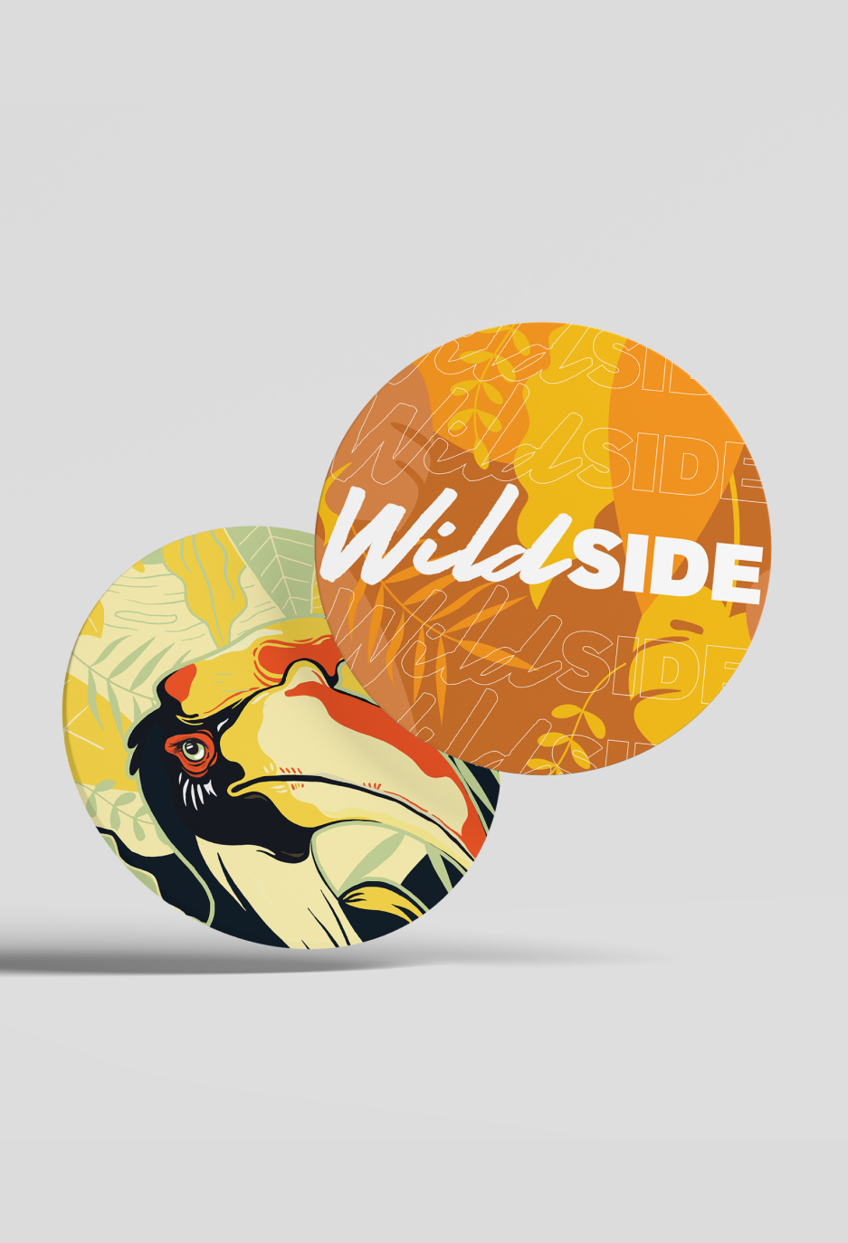
The wordmark does the heavy lifting drawn to be expressive rather than legible-first, with letterforms that behave like the thing the name describes. It’s a deliberately unruly mark for a product whose entire proposition is a bit of unruliness.
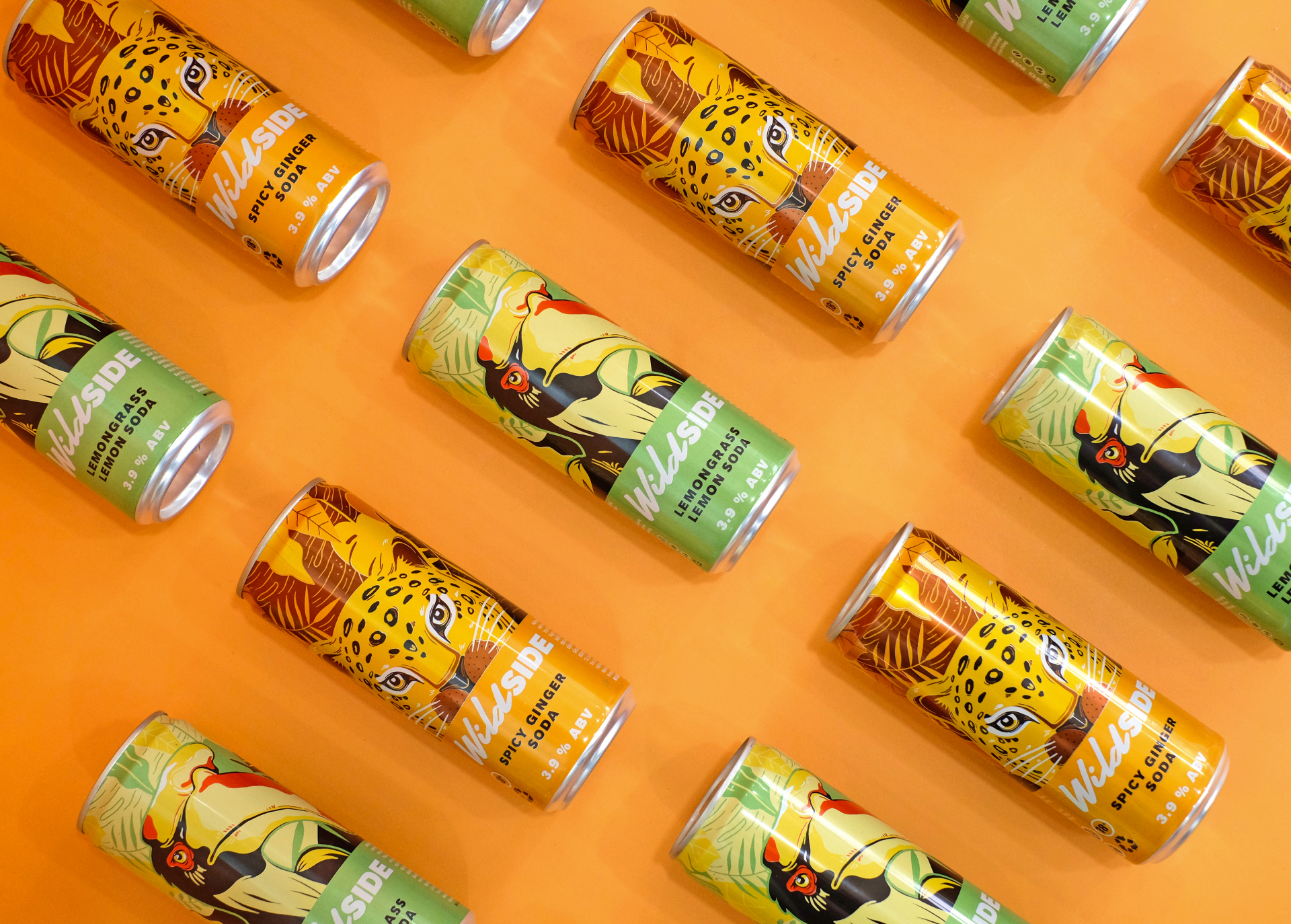
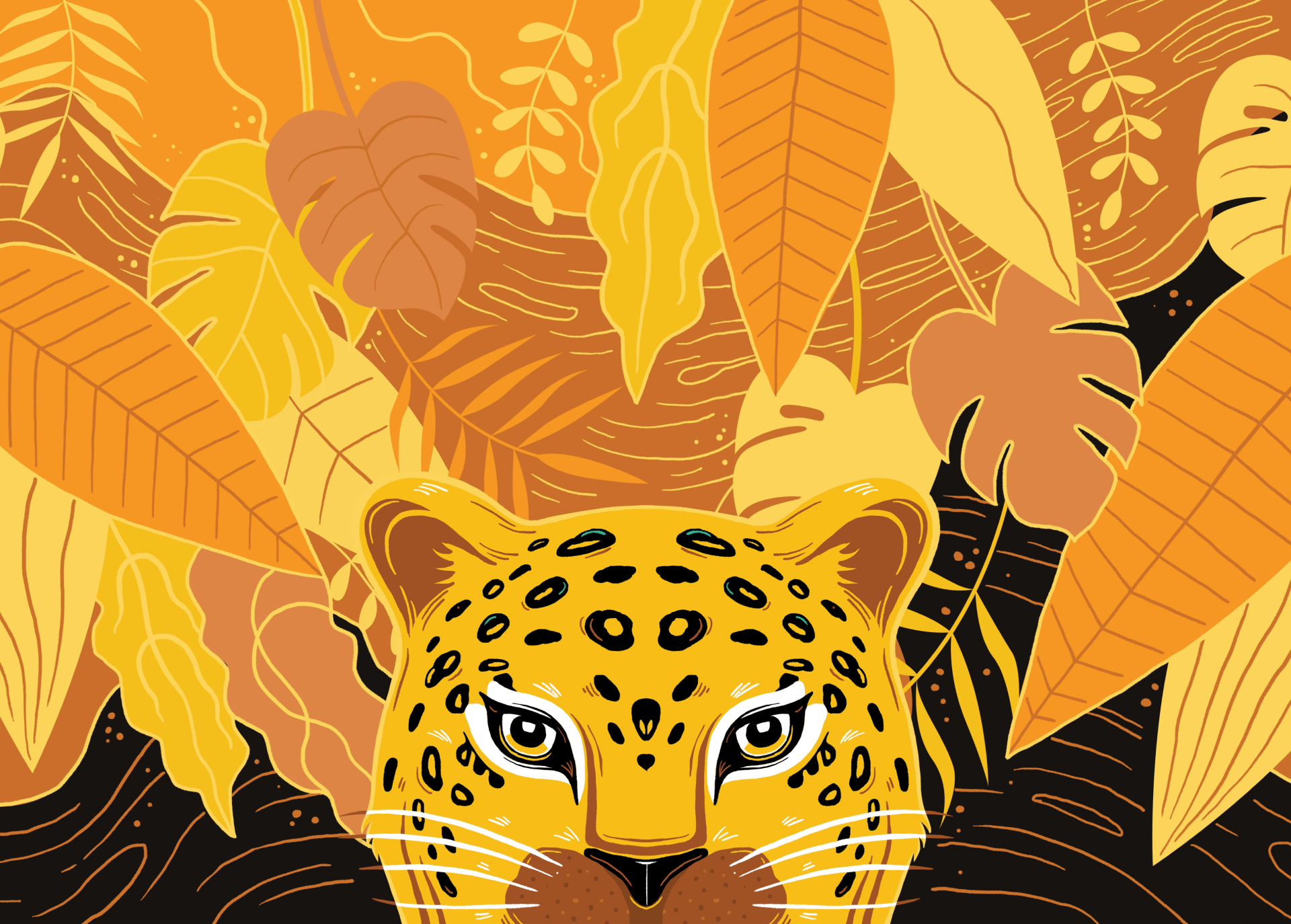
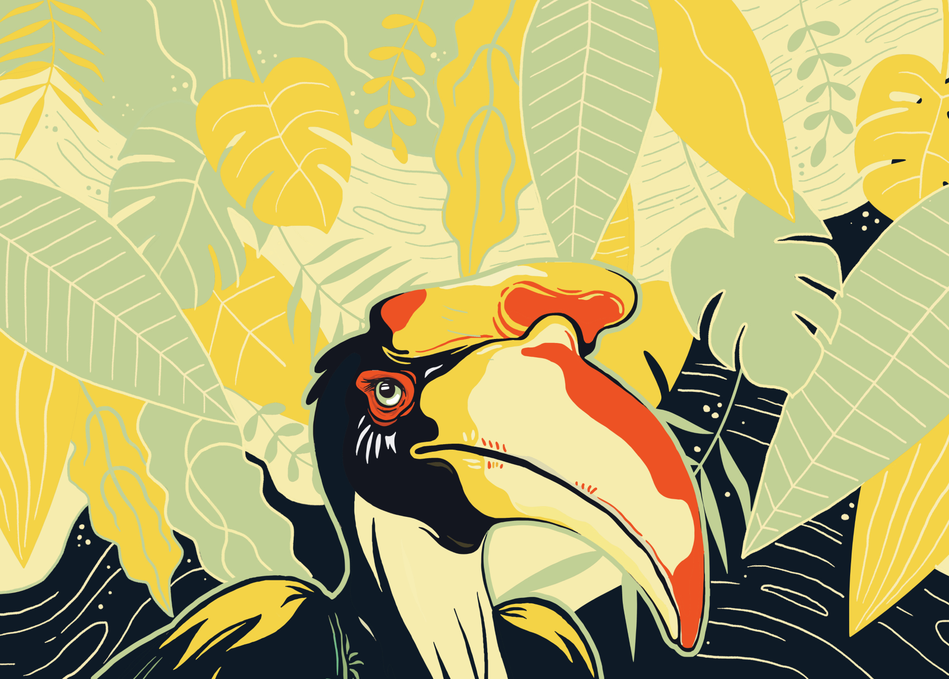
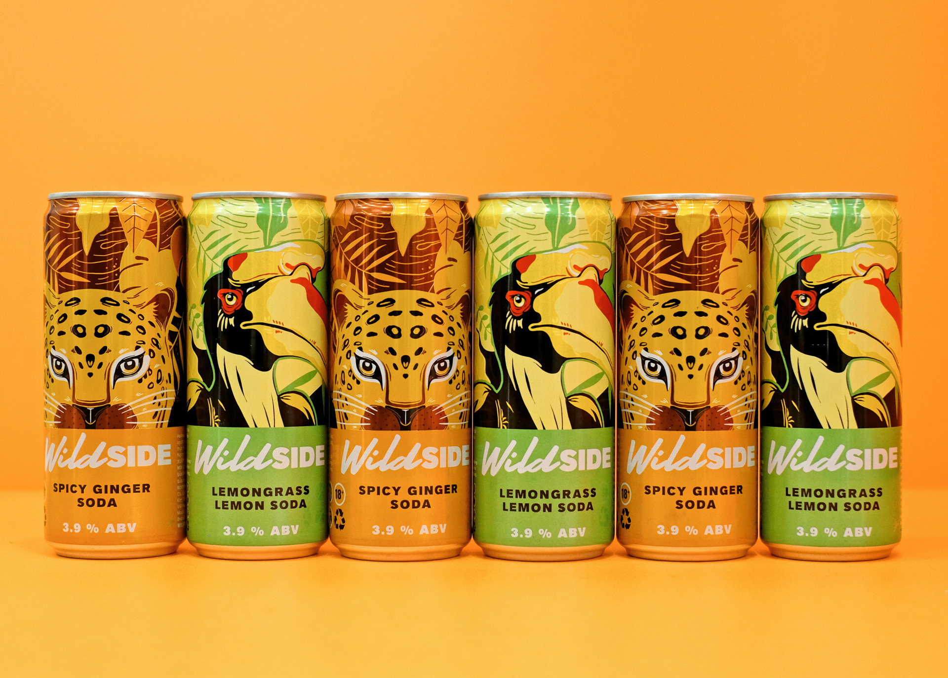
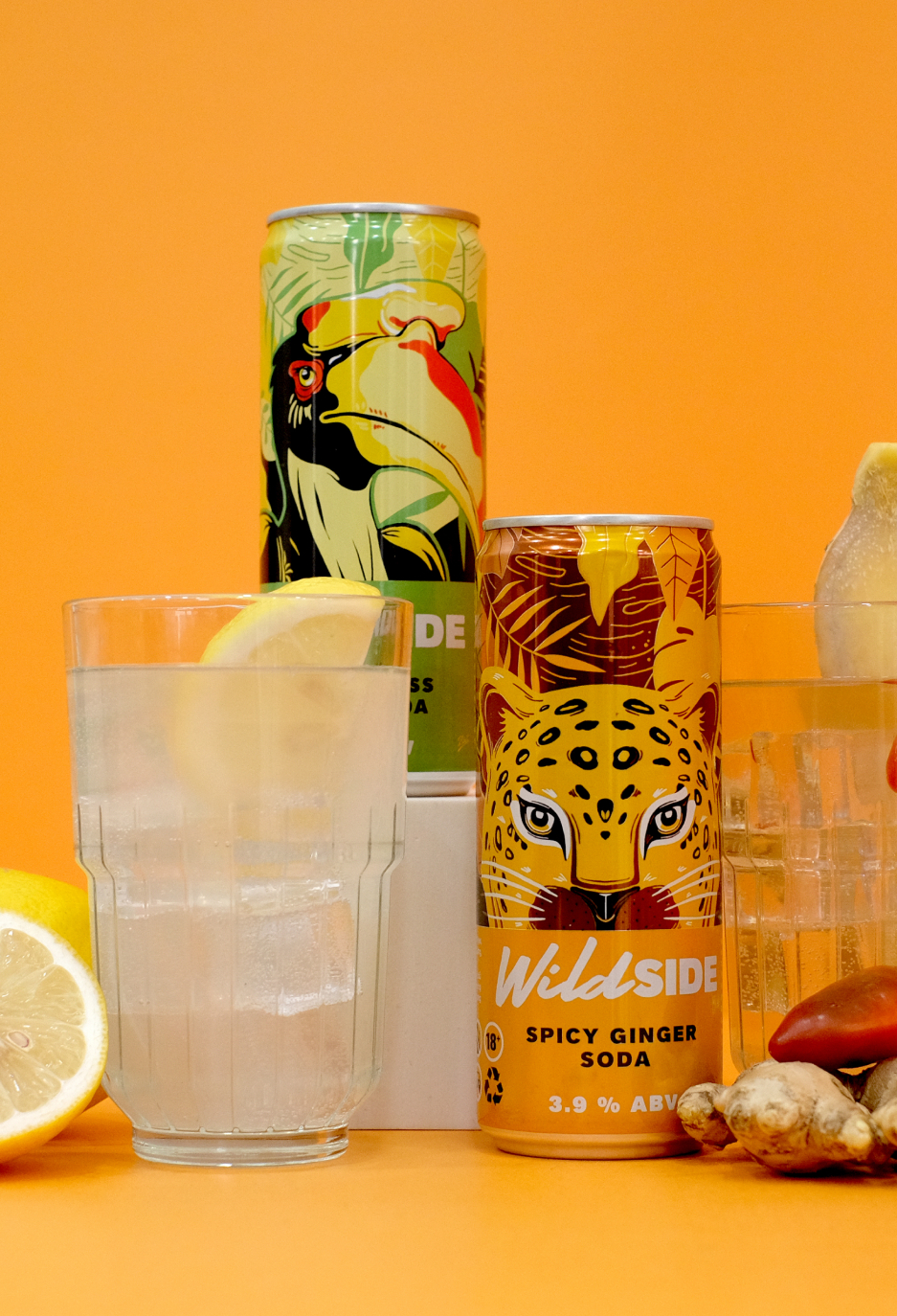
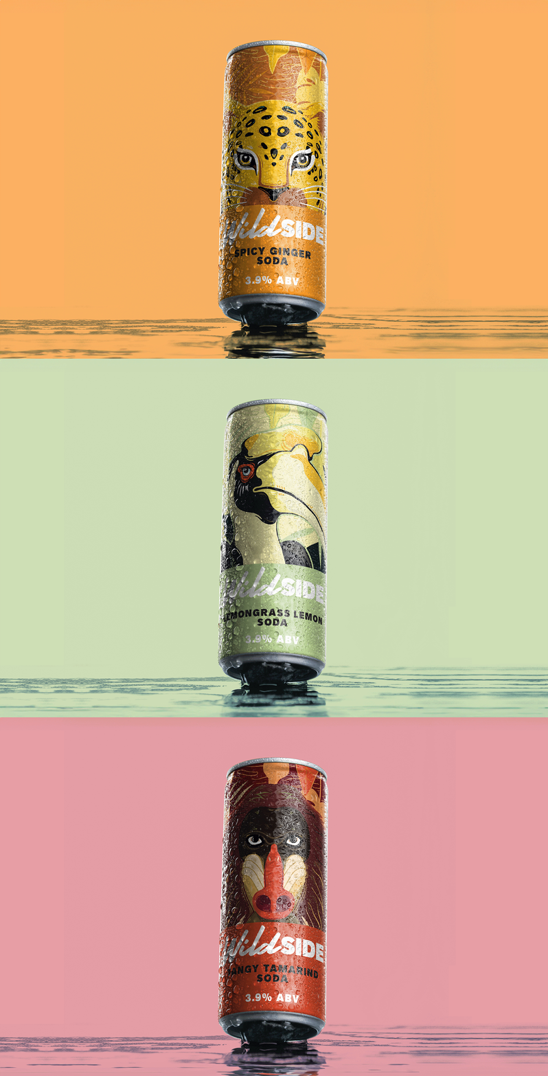
The flavours are then split by character rather than by colour. Each variant gets its own bespoke illustrated creature, drawn specifically for that flavour, so the range works as a cast instead of a colourway. It’s a more expensive route than a palette shift and a better one a shopper remembers a character, and a set invites collecting in a way that a spectrum of pastel cans never does.
Texture and saturated colour carry it the rest of the way. On shelf and in hand, it is trying to be seen, which is the correct ambition for a challenger drink.
Client Wildside
Location Vietnam
Scope Brand identity · Wordmark design · Character illustration · Packaging design
Sector Drinks branding and beverage packaging design