Layah travel company identity
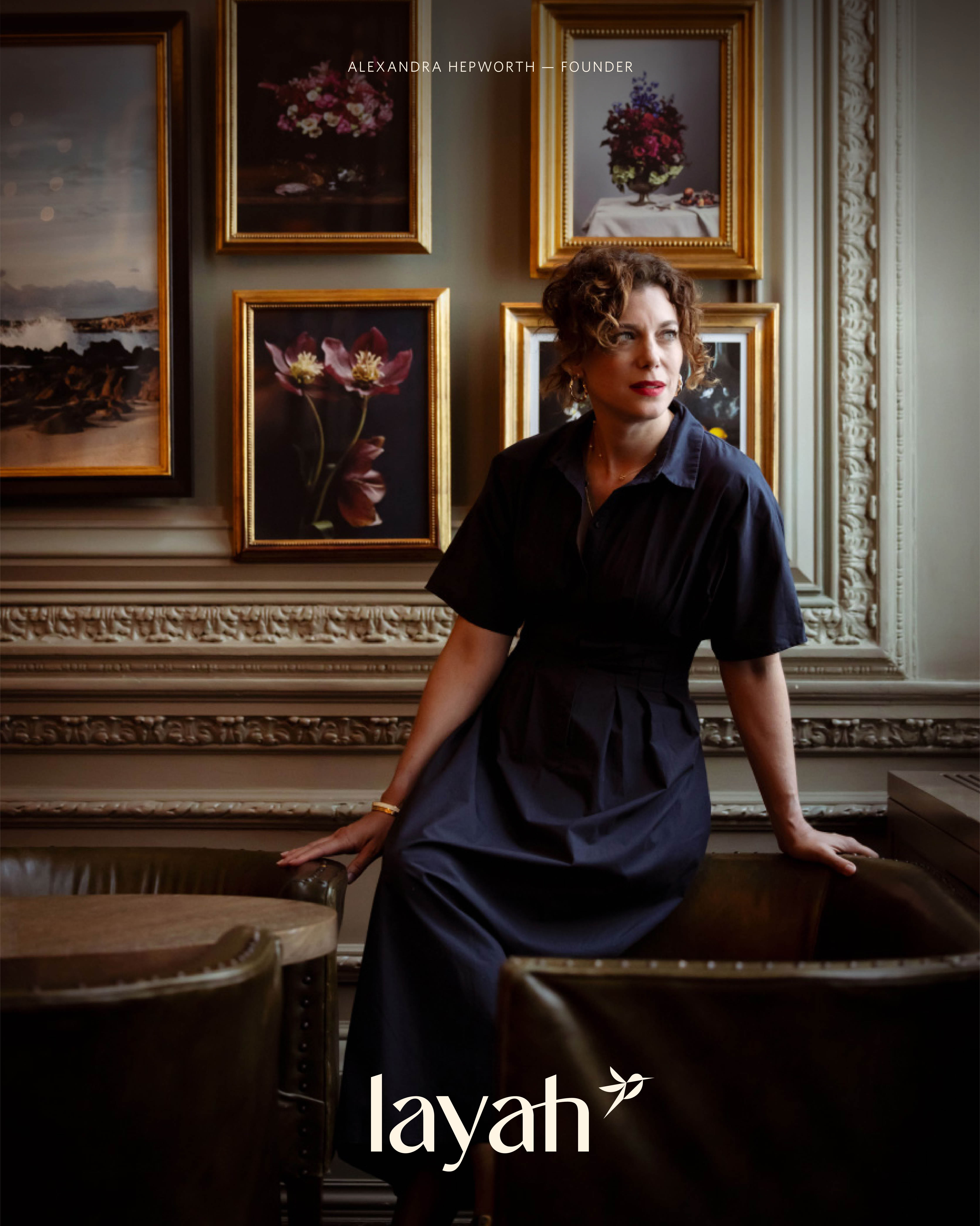
A luxury travel company built on personally designed, culturally deep journeys where the founder is the product, and the brand has to carry that without collapsing into a personal website.


The name Layah takes Laya, the remote village in northern Bhutan, and closes it with “ah” Alexandra Hepworth’s initials. The founder sits inside the word itself, present to anyone who knows and invisible to anyone who doesn’t a quieter way of signalling the personal attention the company is actually selling than saying so outright.
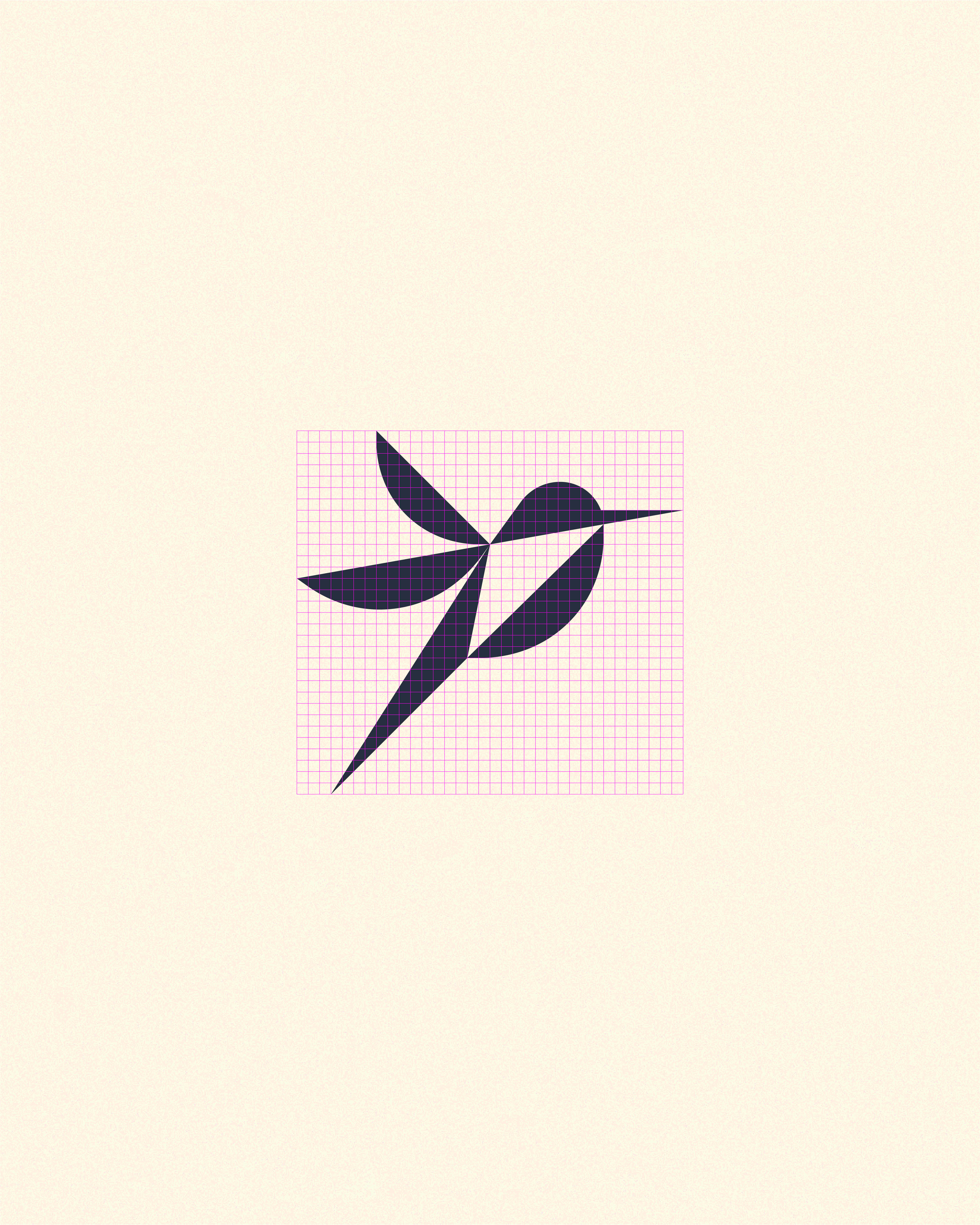
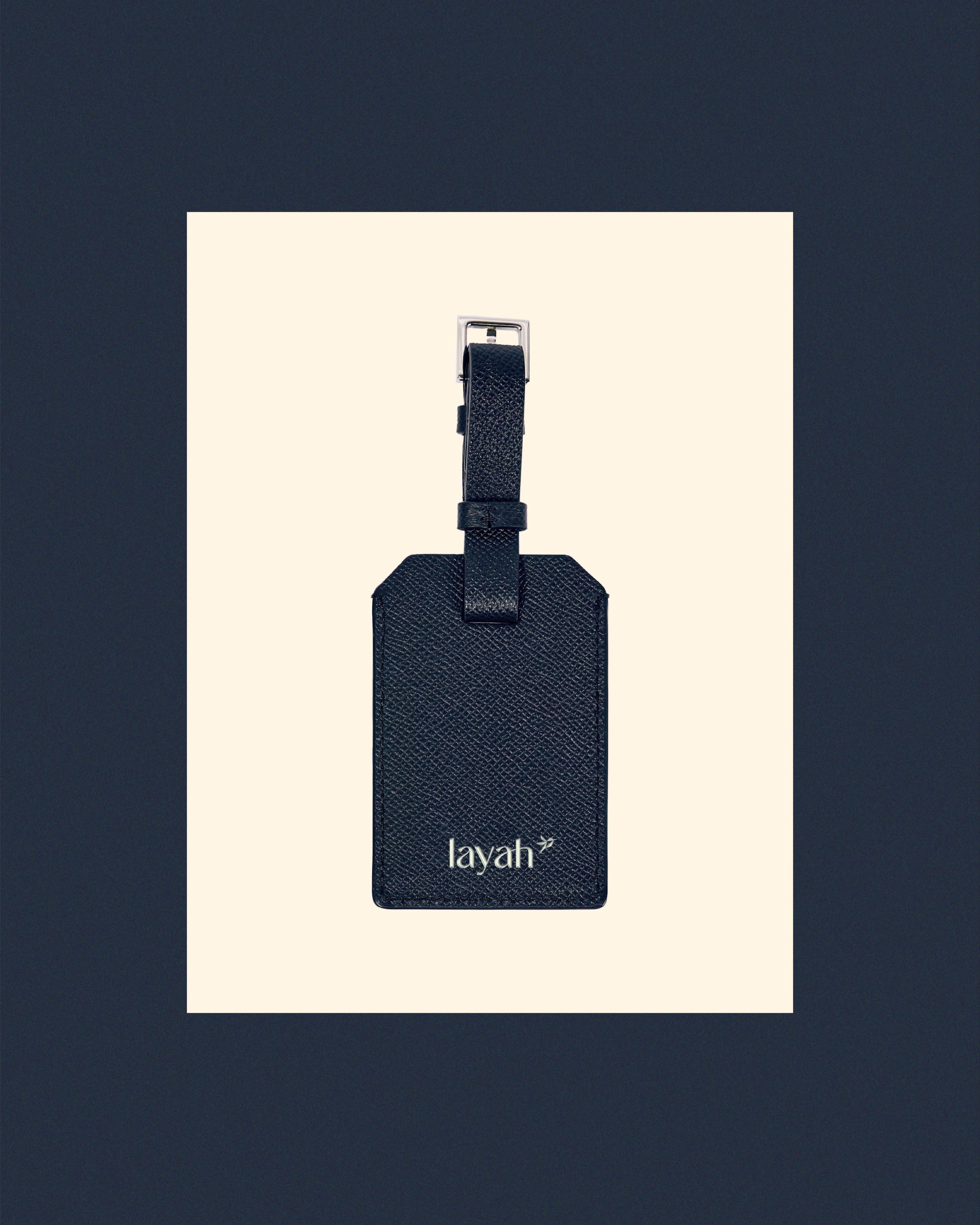
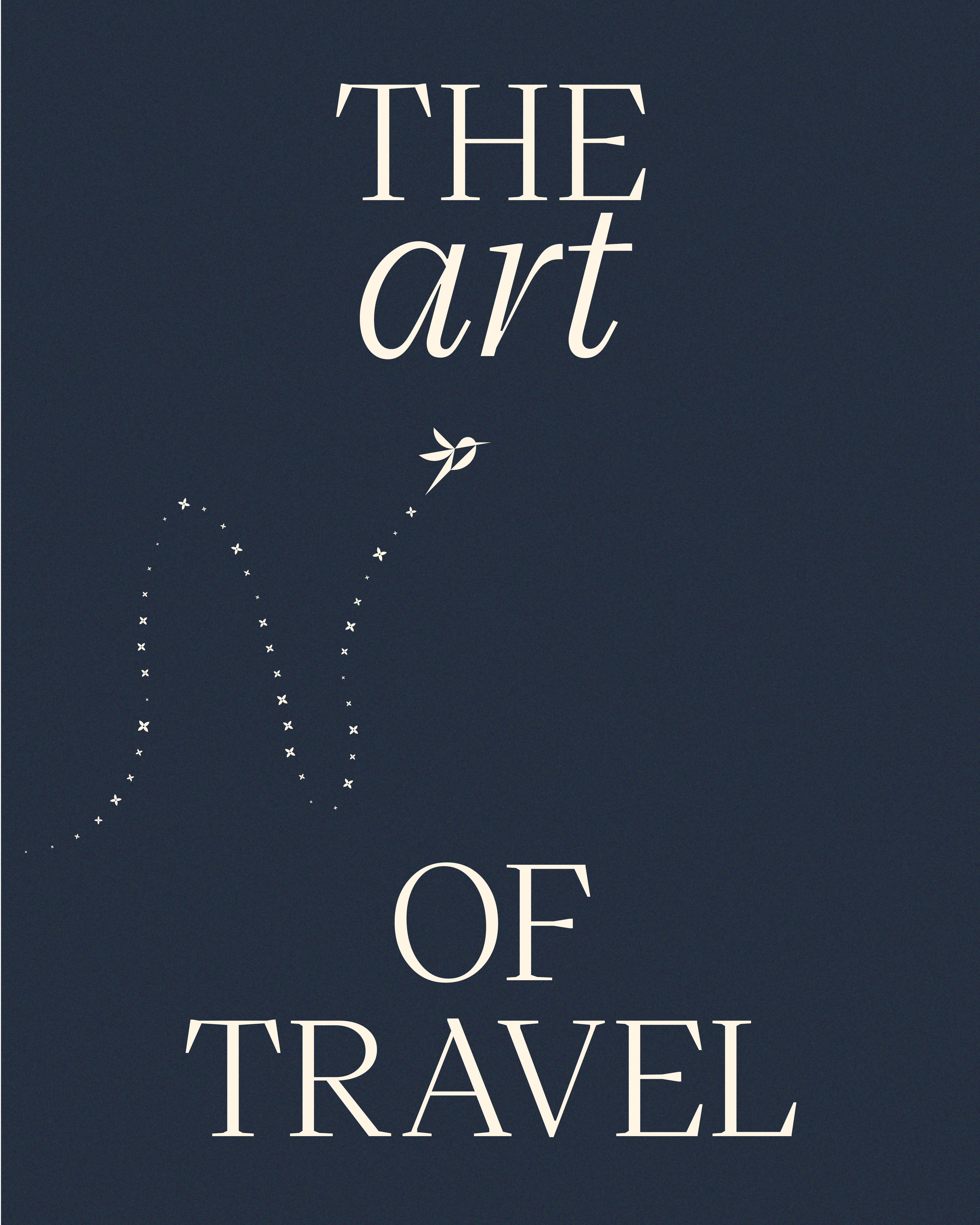
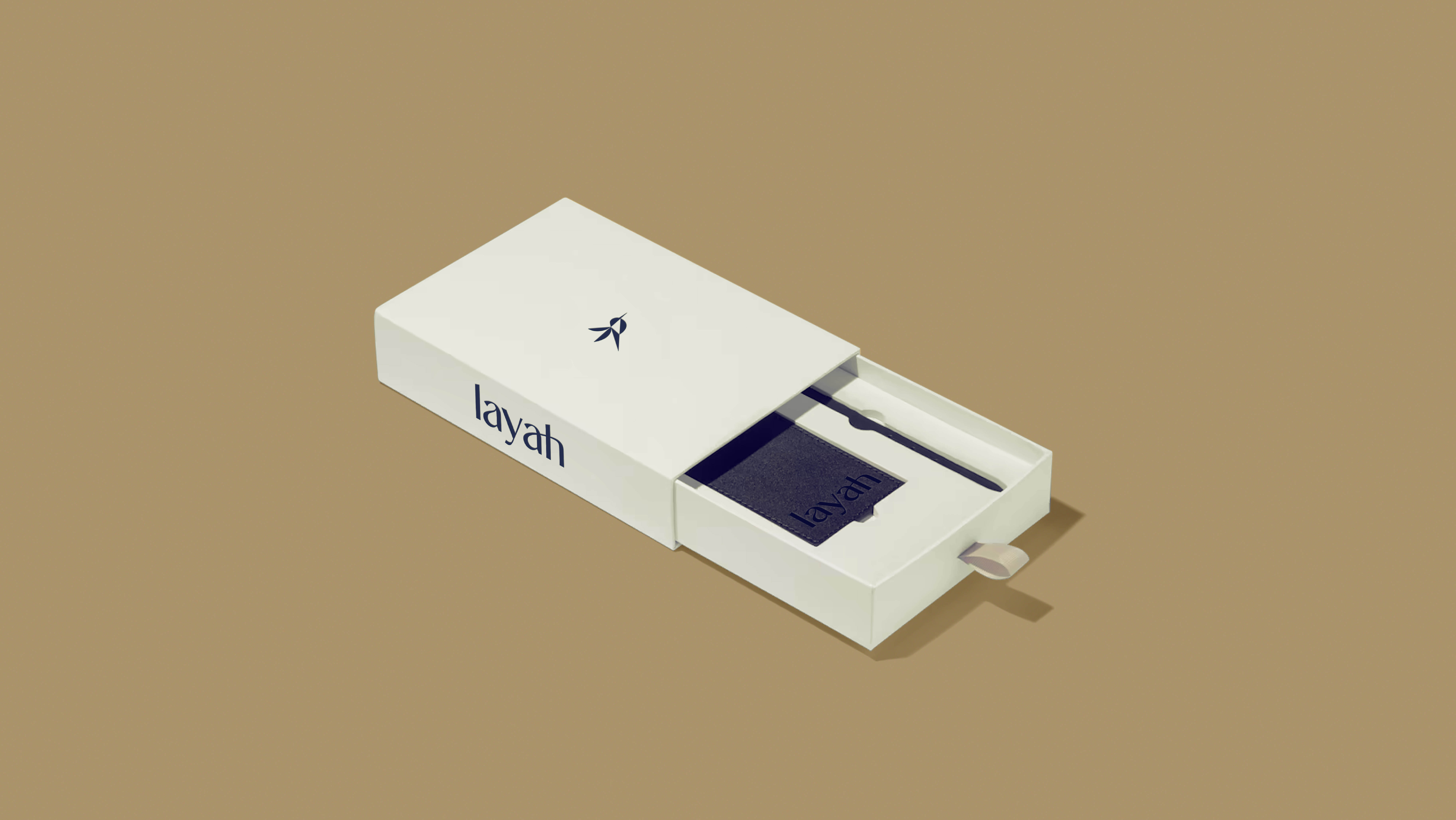
The symbol is a hummingbird: agile, precise, and capable of holding perfectly still mid-flight. Drawn fine and small, it’s built to sit on a boarding wallet, not to fill a billboard.
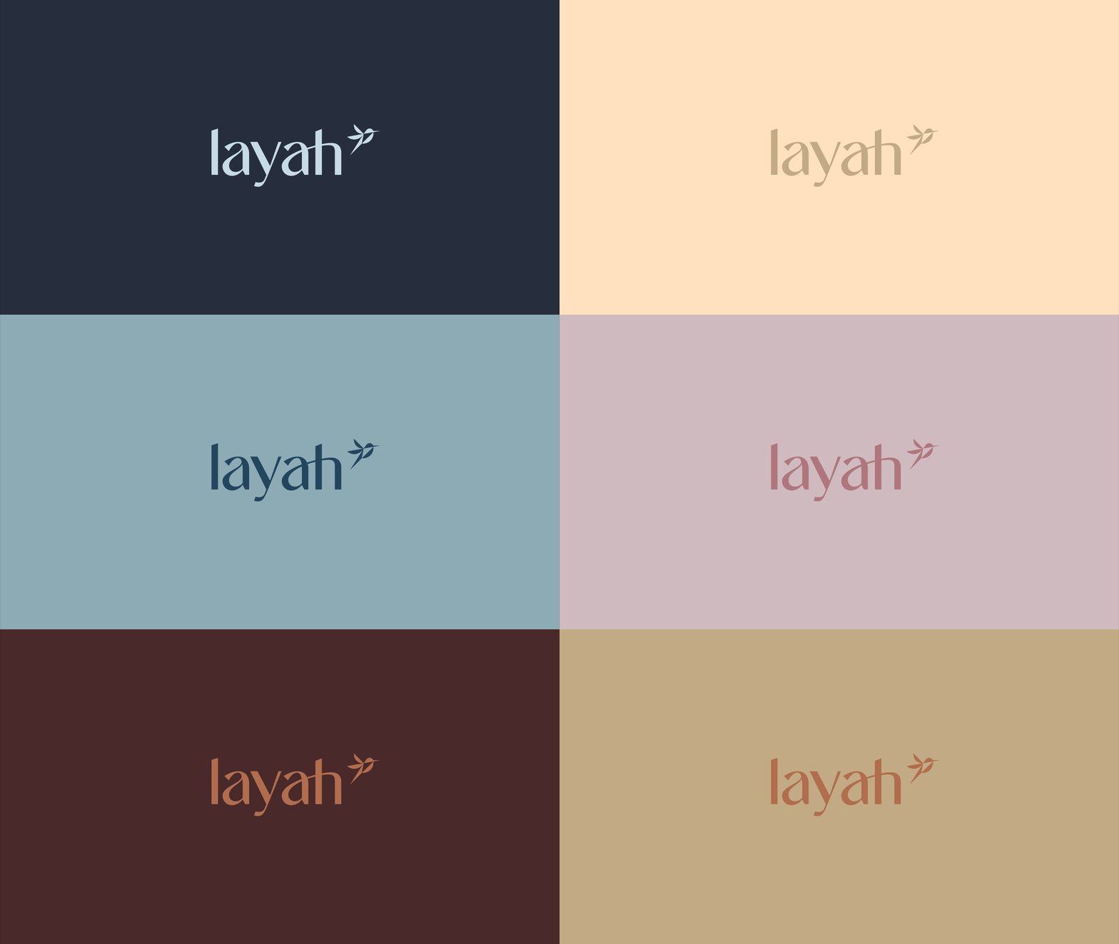
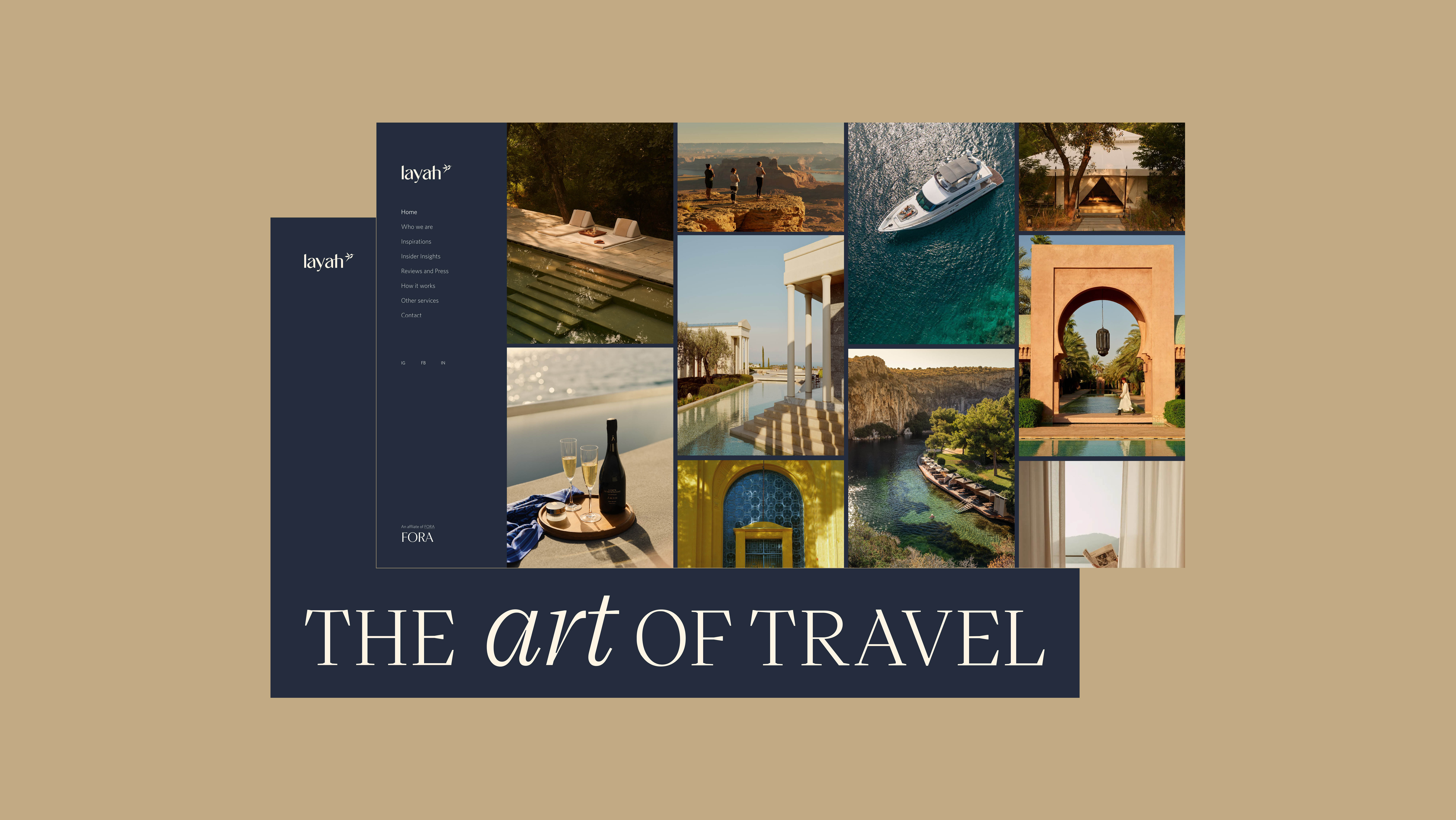
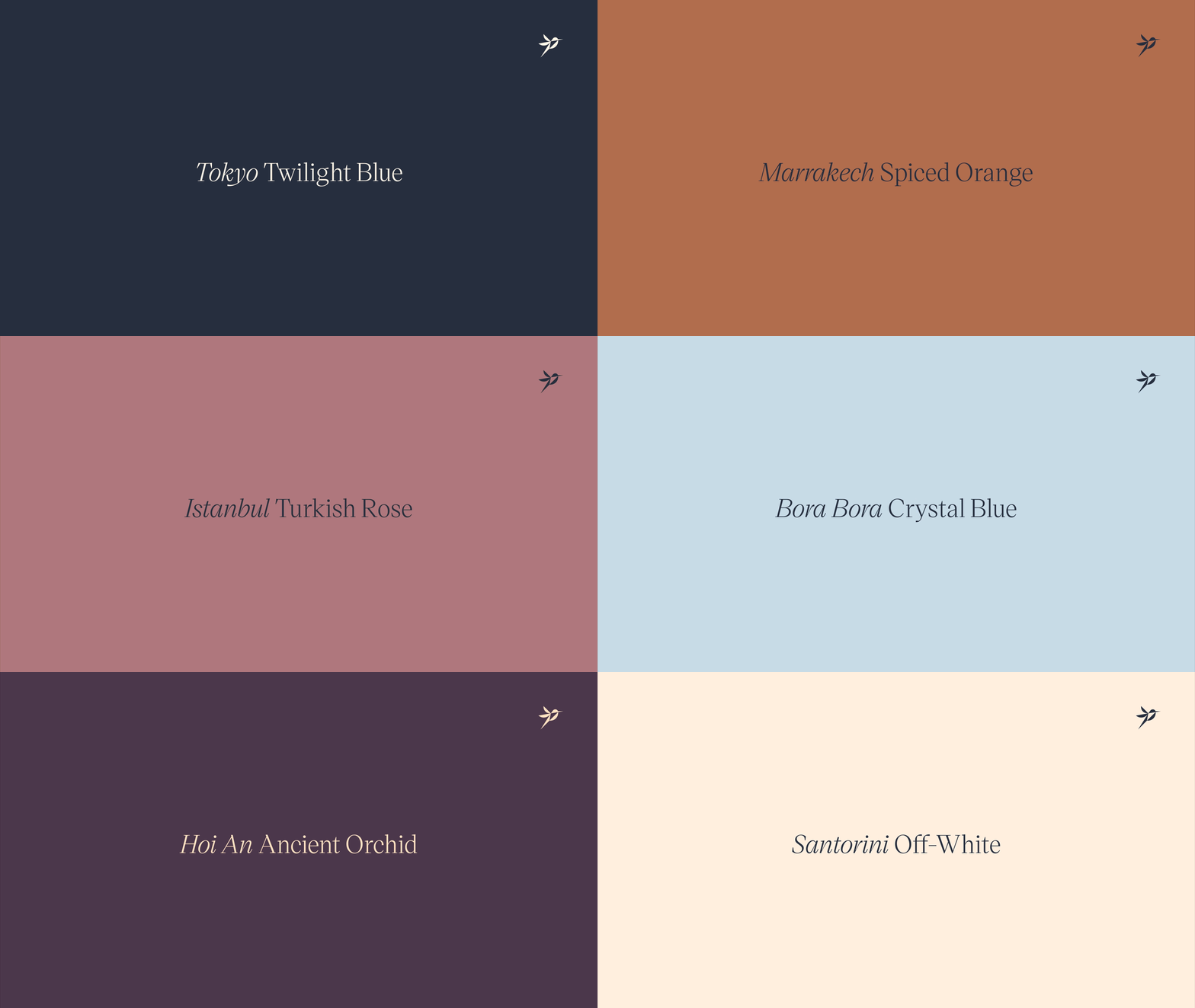
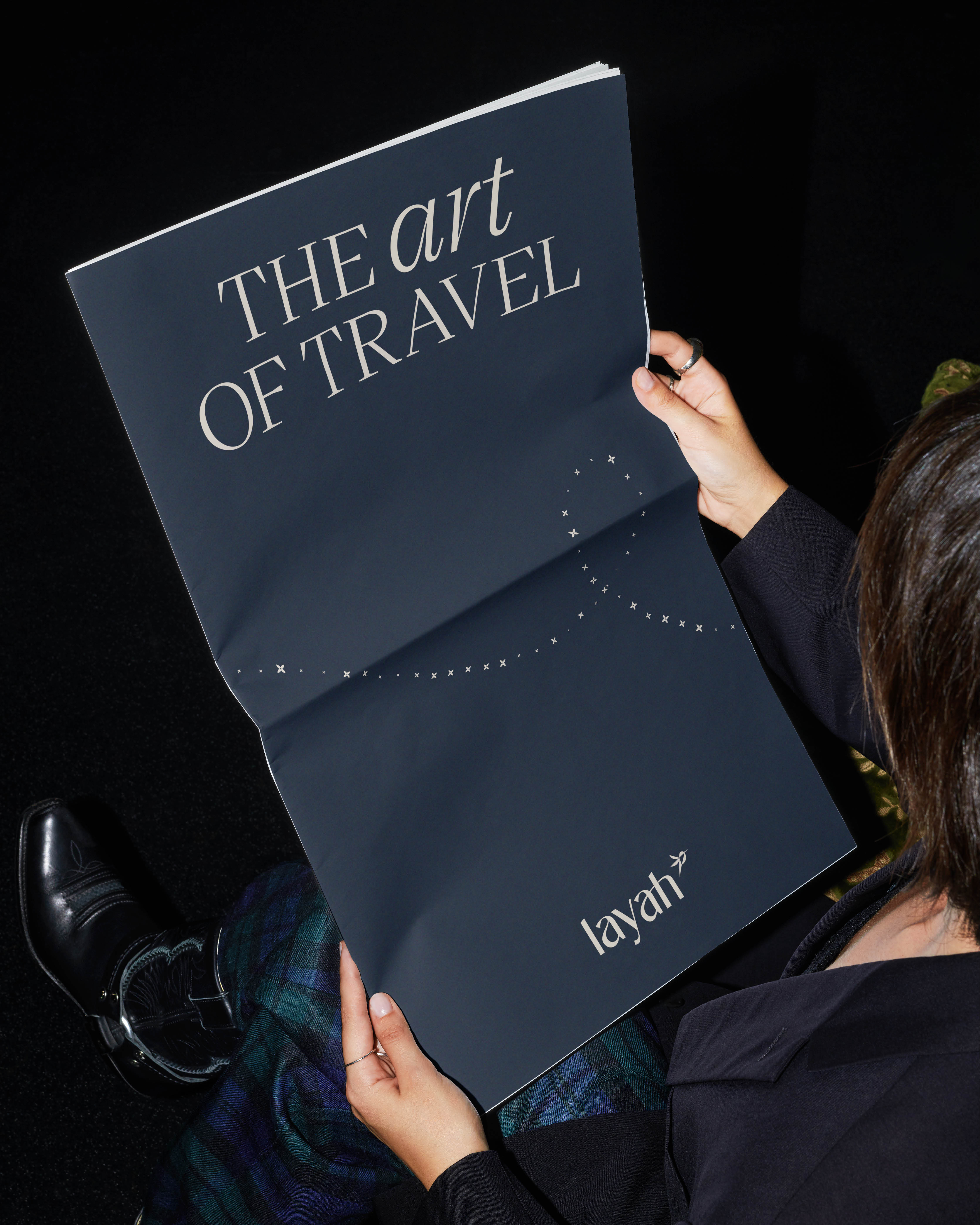
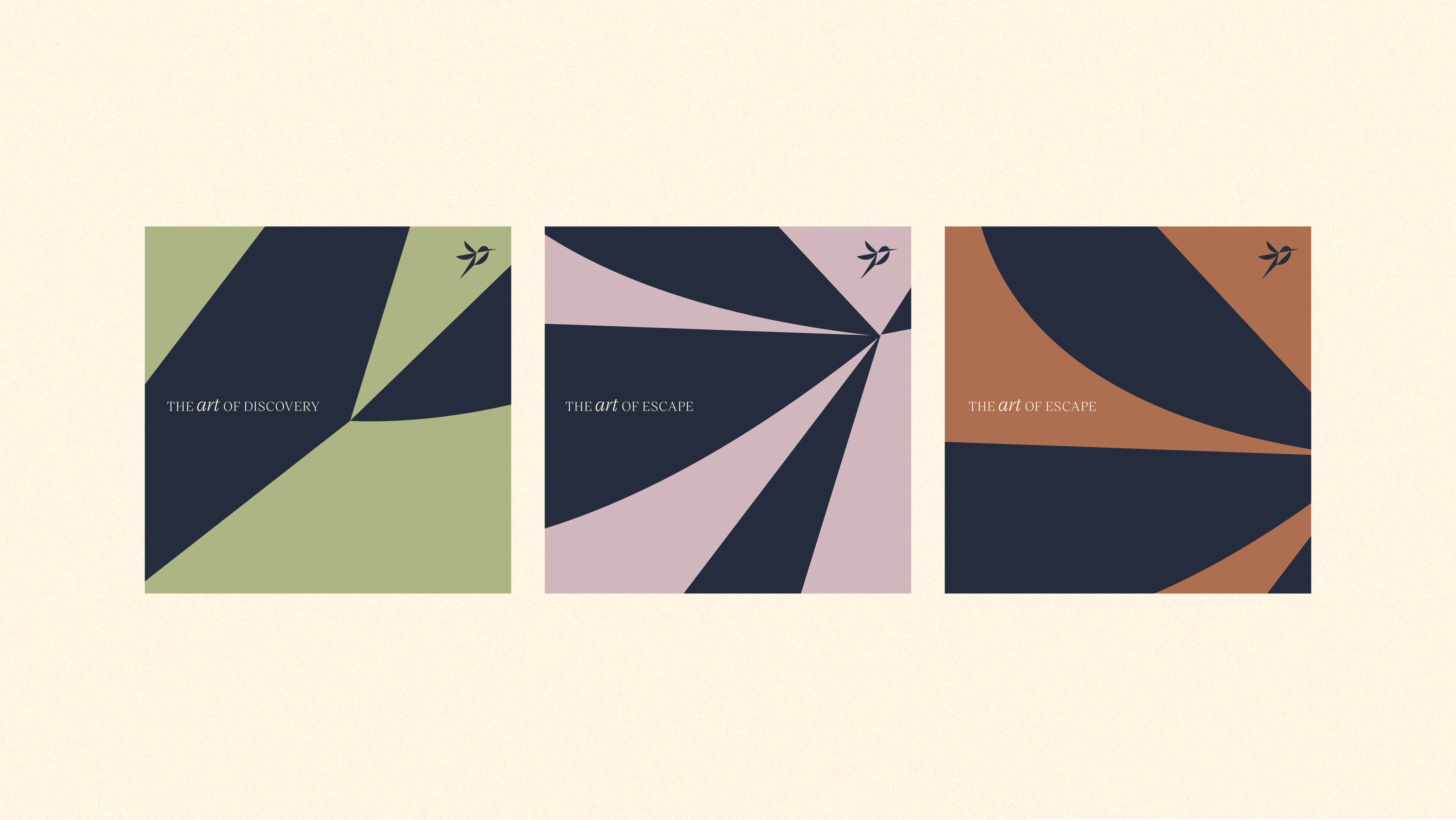
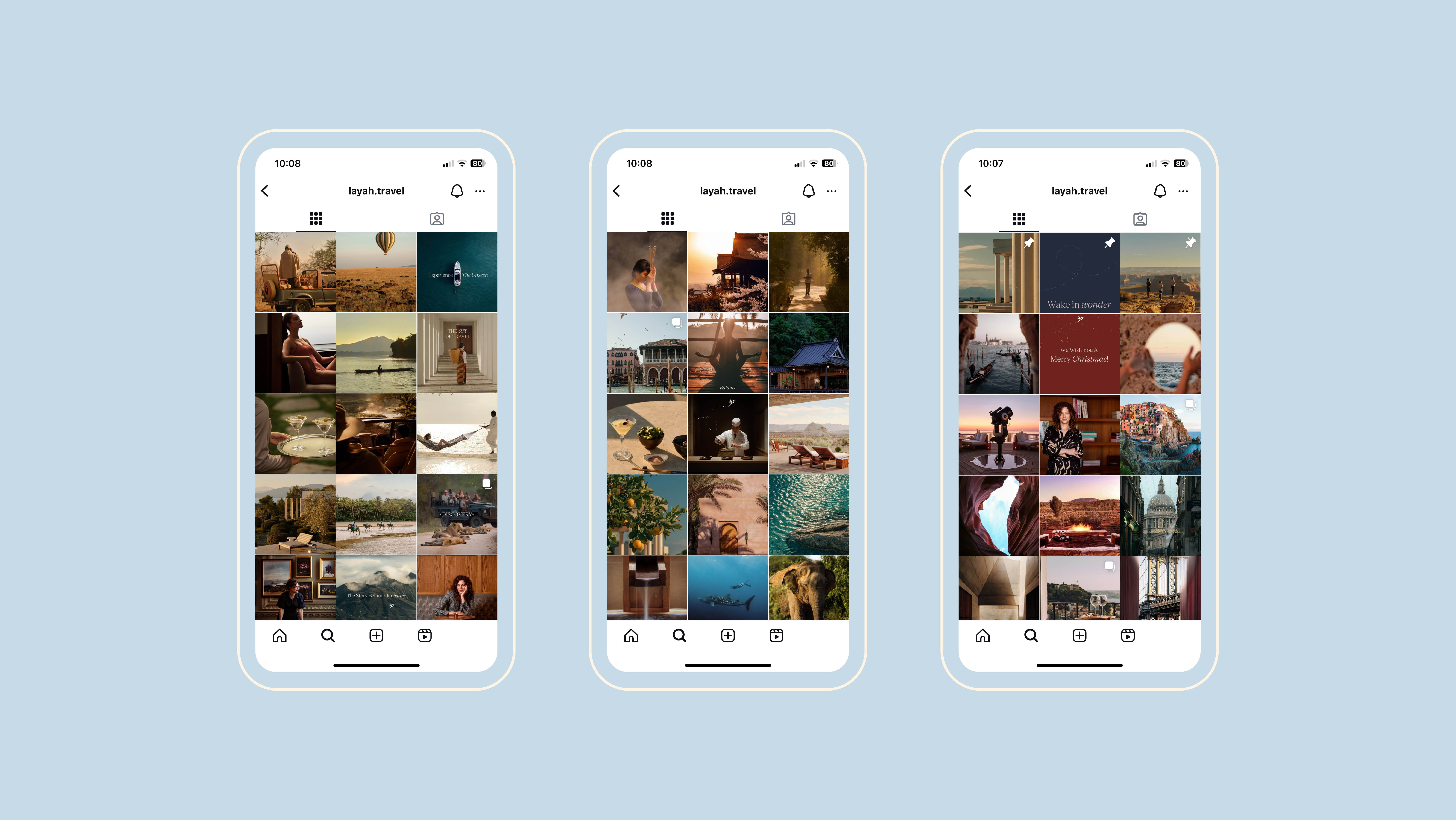
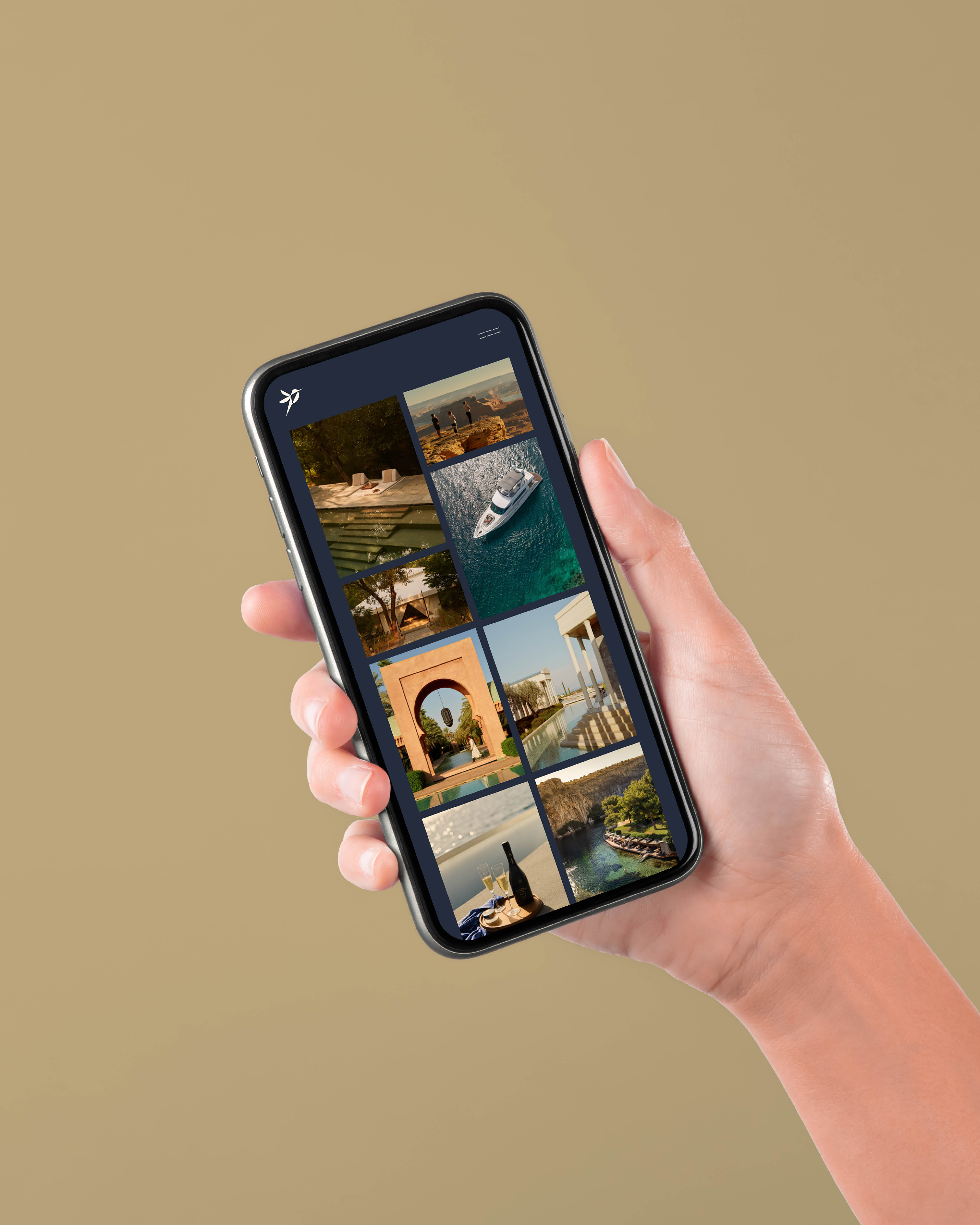
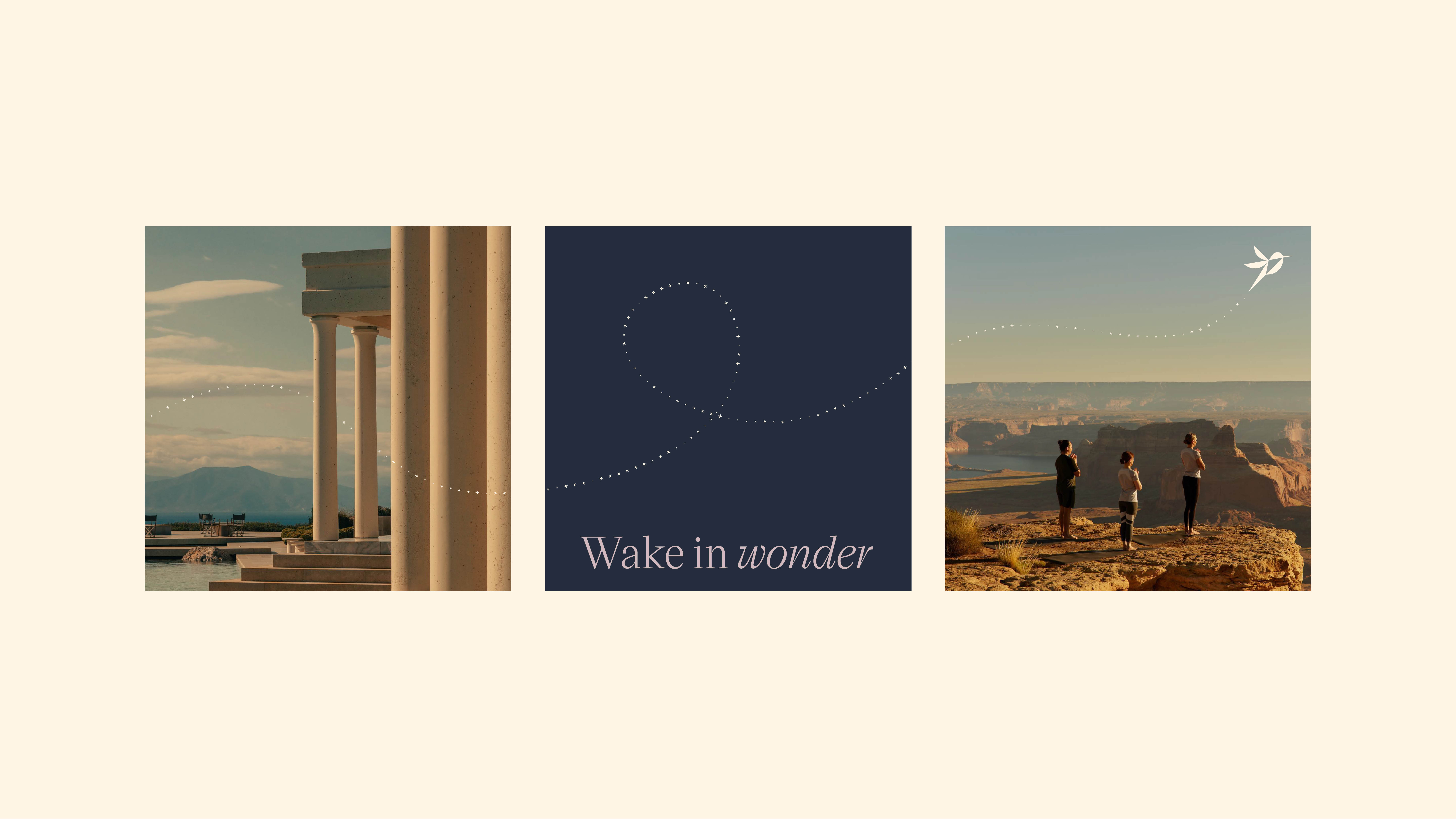
The palette comes from the destinations themselves rather than a fixed luxury-brand playbook, so the identity carries the range of the places it sells instead of imposing one look on all of them. That same discipline holds on the website, where the identity stays legible and composed without needing to raise its voice.
Client Layah founded by Alexandra Hepworth
Location Vietnam
Scope Brand naming · Brand positioning · Brand identity · Logo design · Website design · Brand guidelines
Sector Luxury travel and experience branding