Hoiana Hotel & Suites
The fourth accommodation brand inside Vietnam’s first integrated resort distinct enough to sell on its own, close enough that nobody wonders whether it belongs.
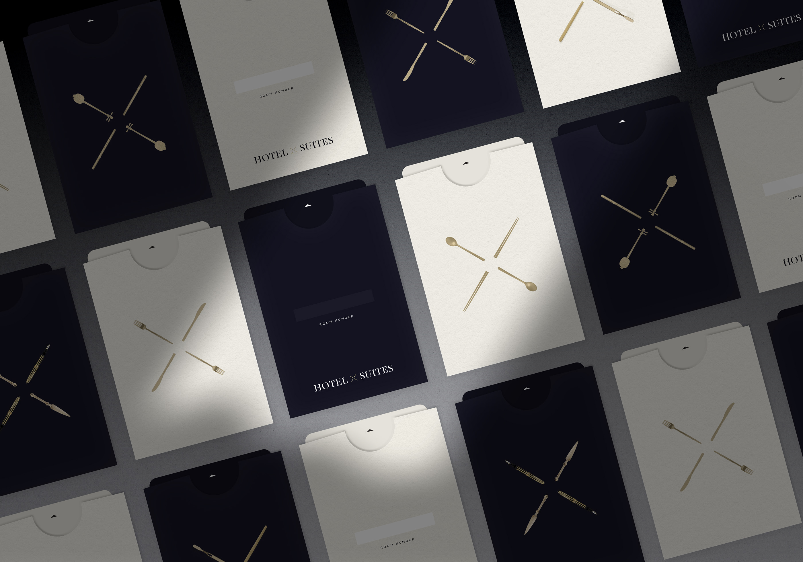
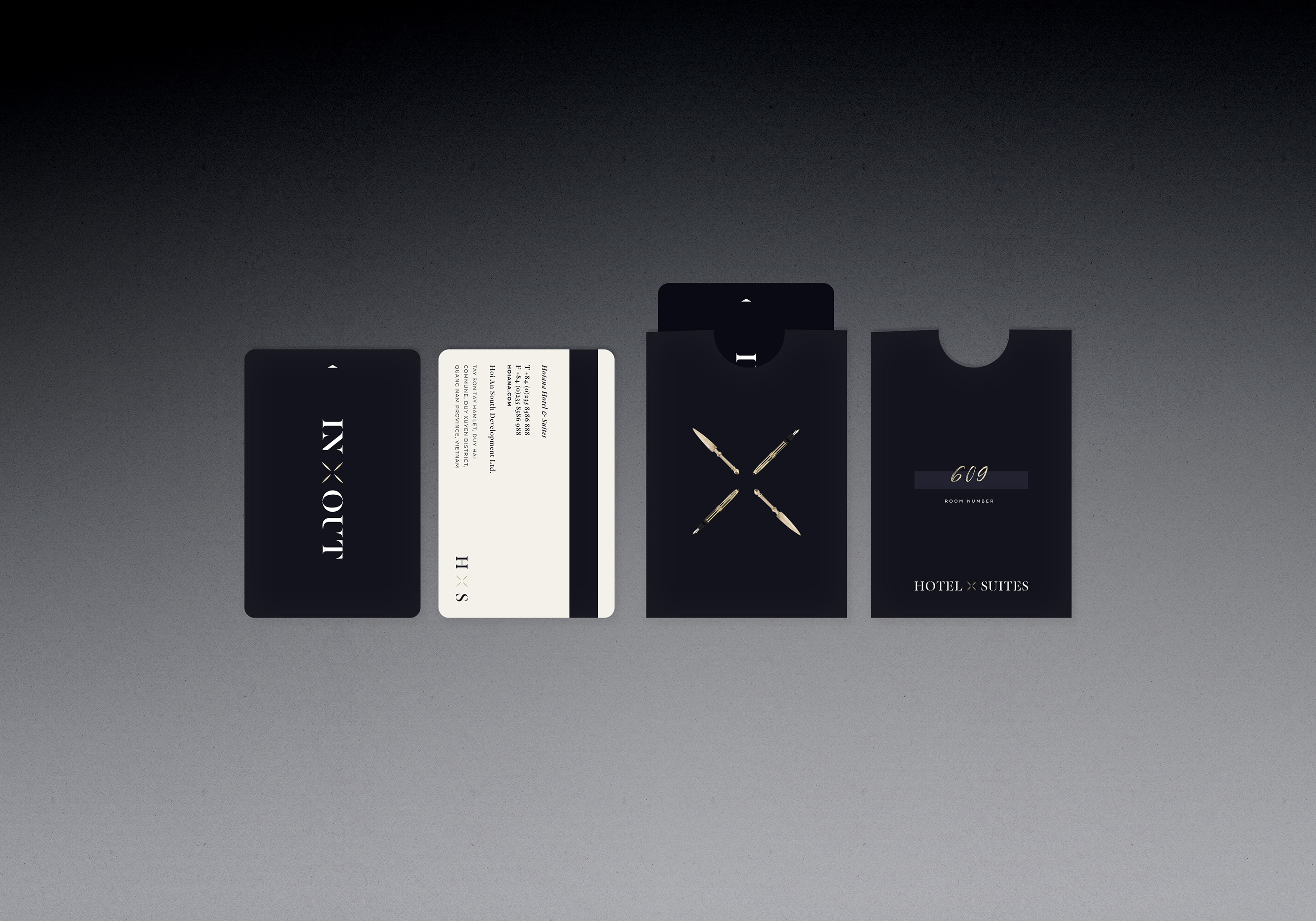
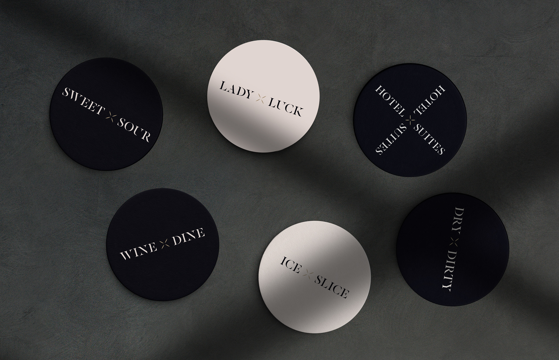
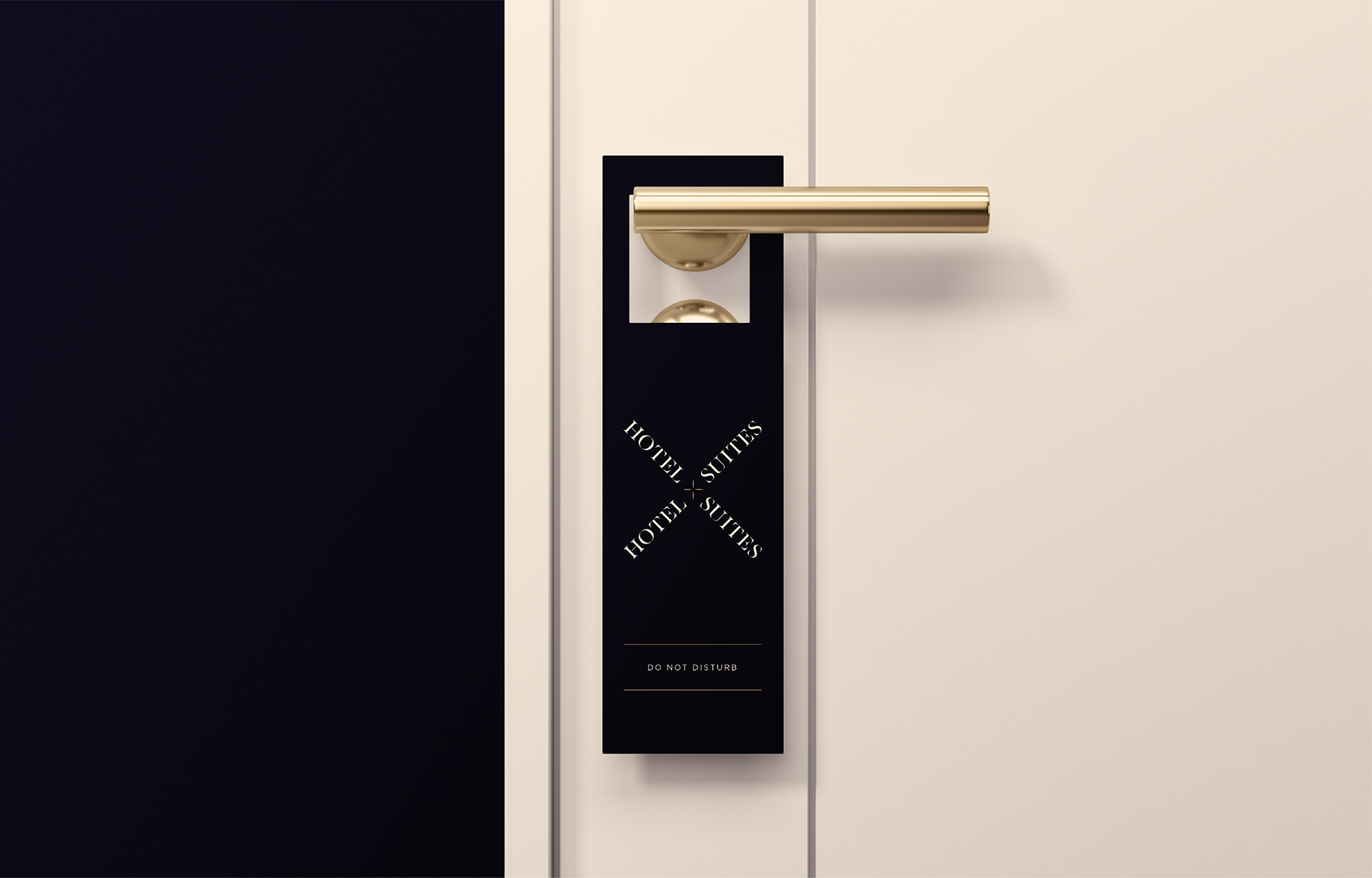
The link to the masterbrand is carried almost entirely by one element: the gold of the firework symbol. Everything else was drawn fresh. The mark resolves into an X HOTEL ✕ SUITES in high-contrast serif capitals, wide-tracked, rotating around a single crossed point. It reads as a monogram, a junction and a star at once, and survives being turned ninety degrees onto a door hanger.
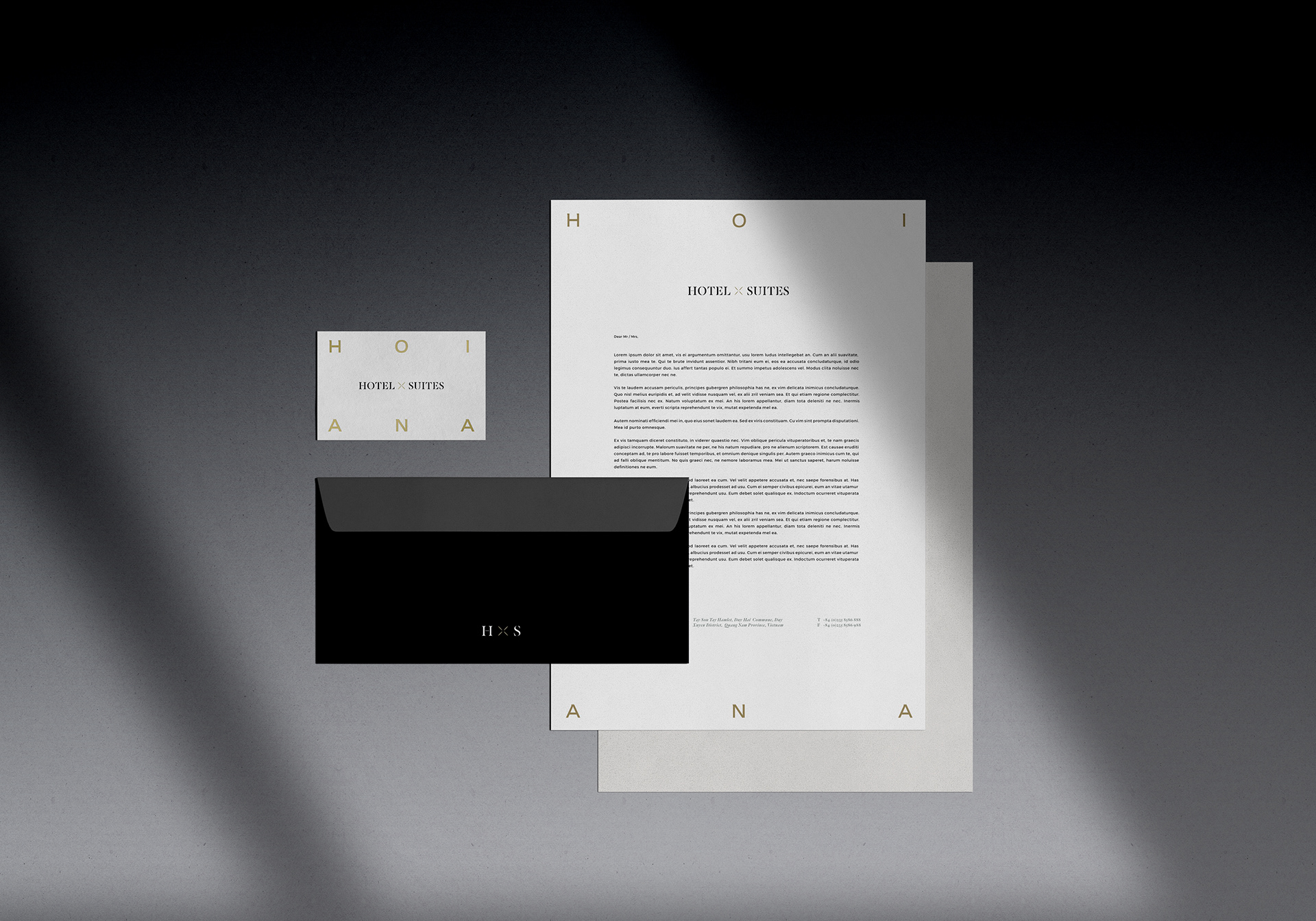
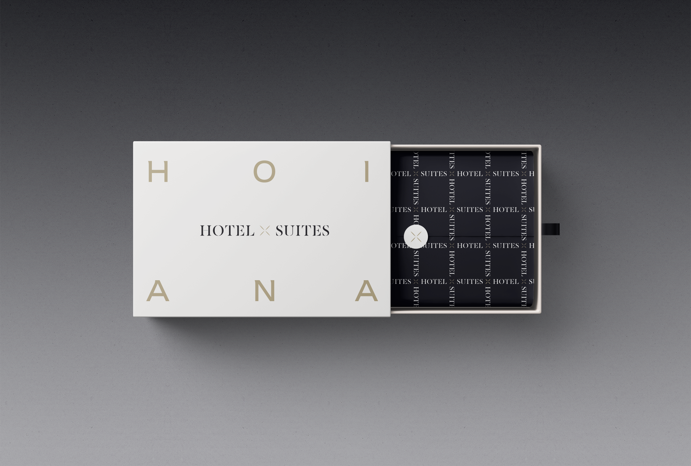
On the stationery the letters of HOIANA are blown up in gold and cropped hard against the trim, so a stack of business cards reads as a pattern before it reads as words. Three materials do all the work: uncoated cream, near-black, gold foil. No secondary palette. At this end of the market the temptation is always to add; the discipline is in refusing.
Client Rosewood Hotel Group
Location Hoi An, Vietnam
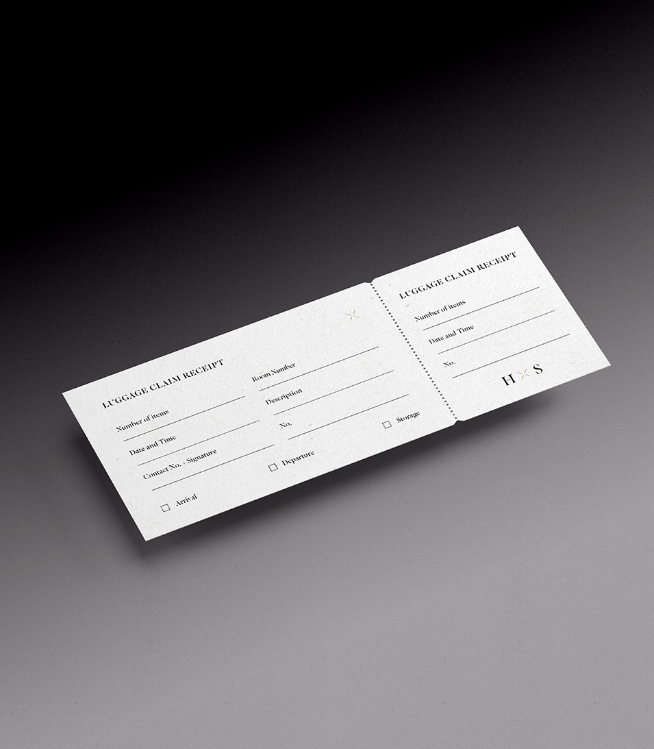
Scope Hotel logo design · Brand identity · Stationery · Keycard and collateral system
Sector Luxury resort branding