Hanoi Milk
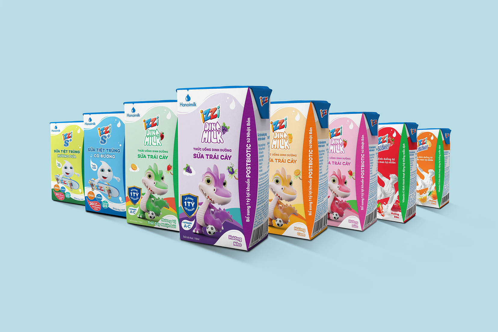
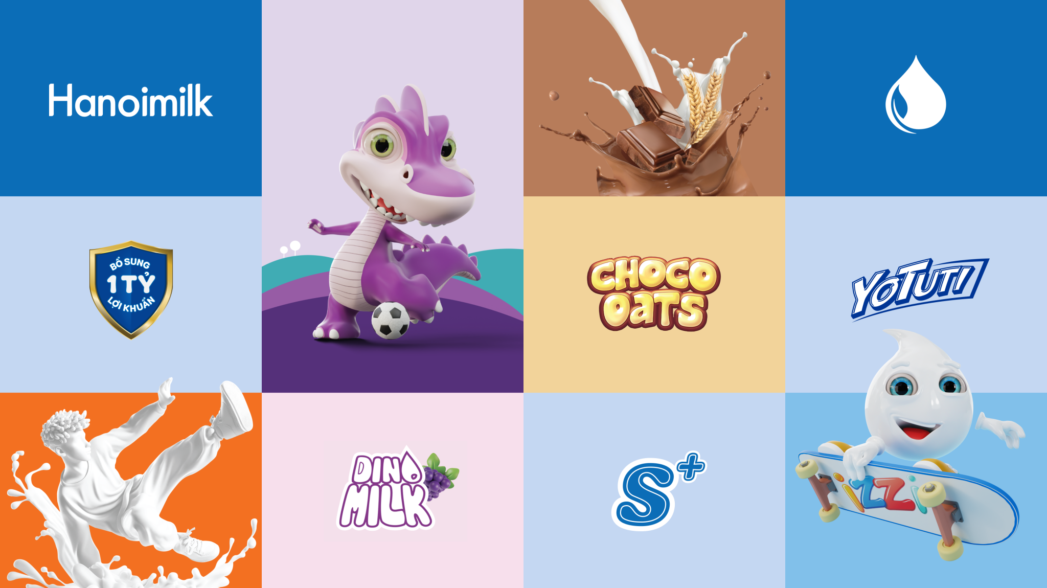
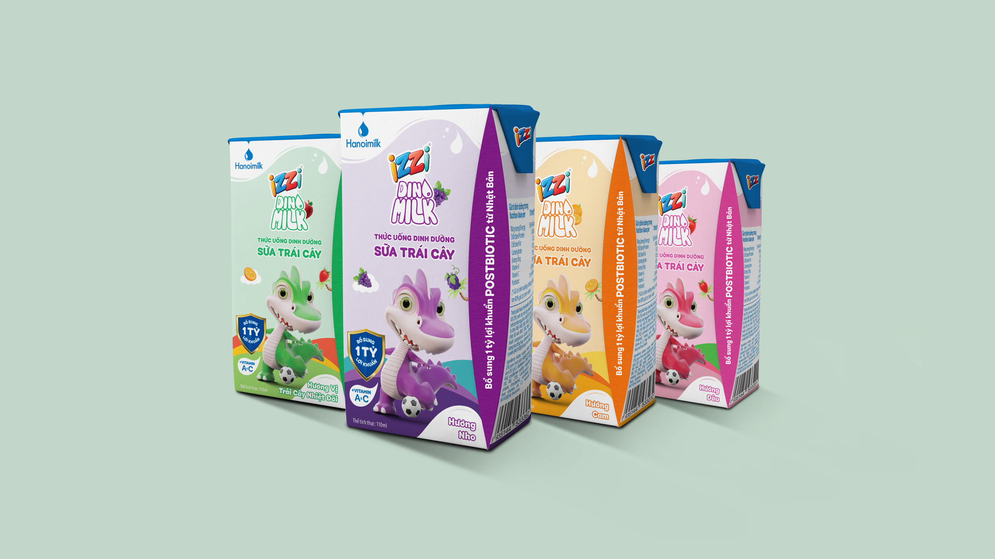
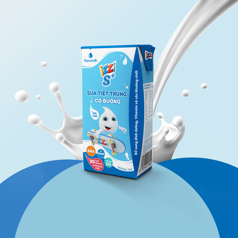
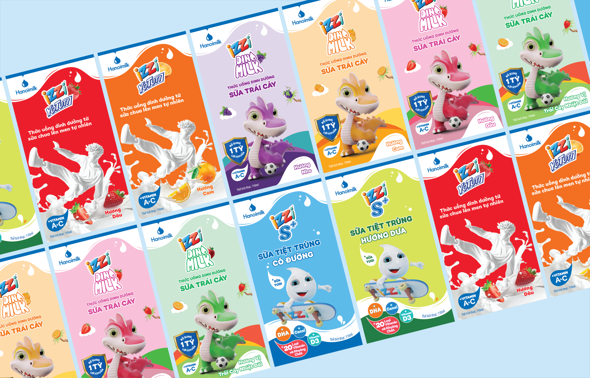
Four product lines Dinomilk, Yotuti, Izzi S+ and ChocoOats each chasing a different age group, all needing to be recognisable as one company.
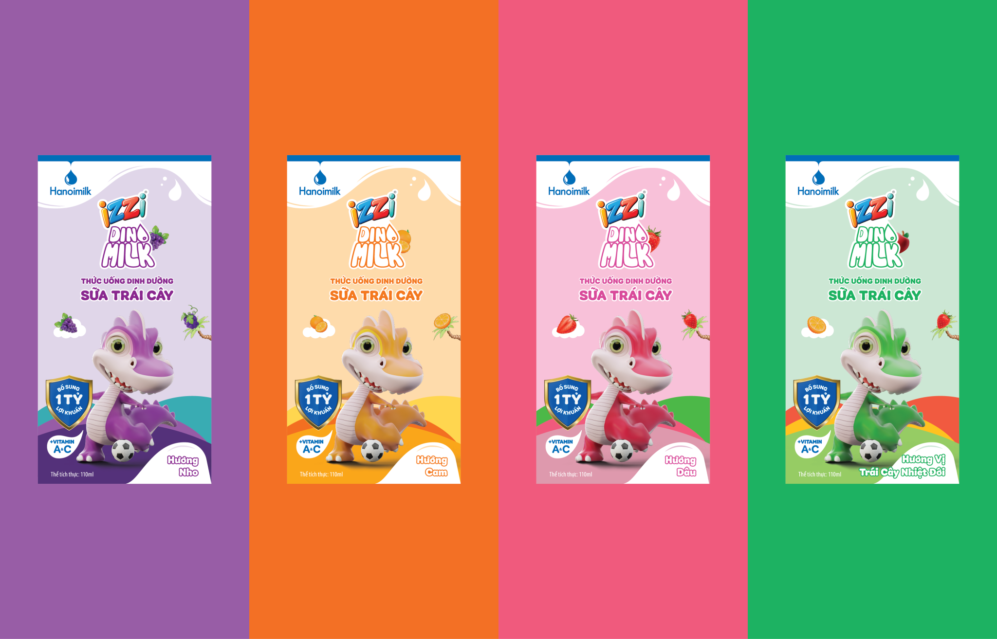
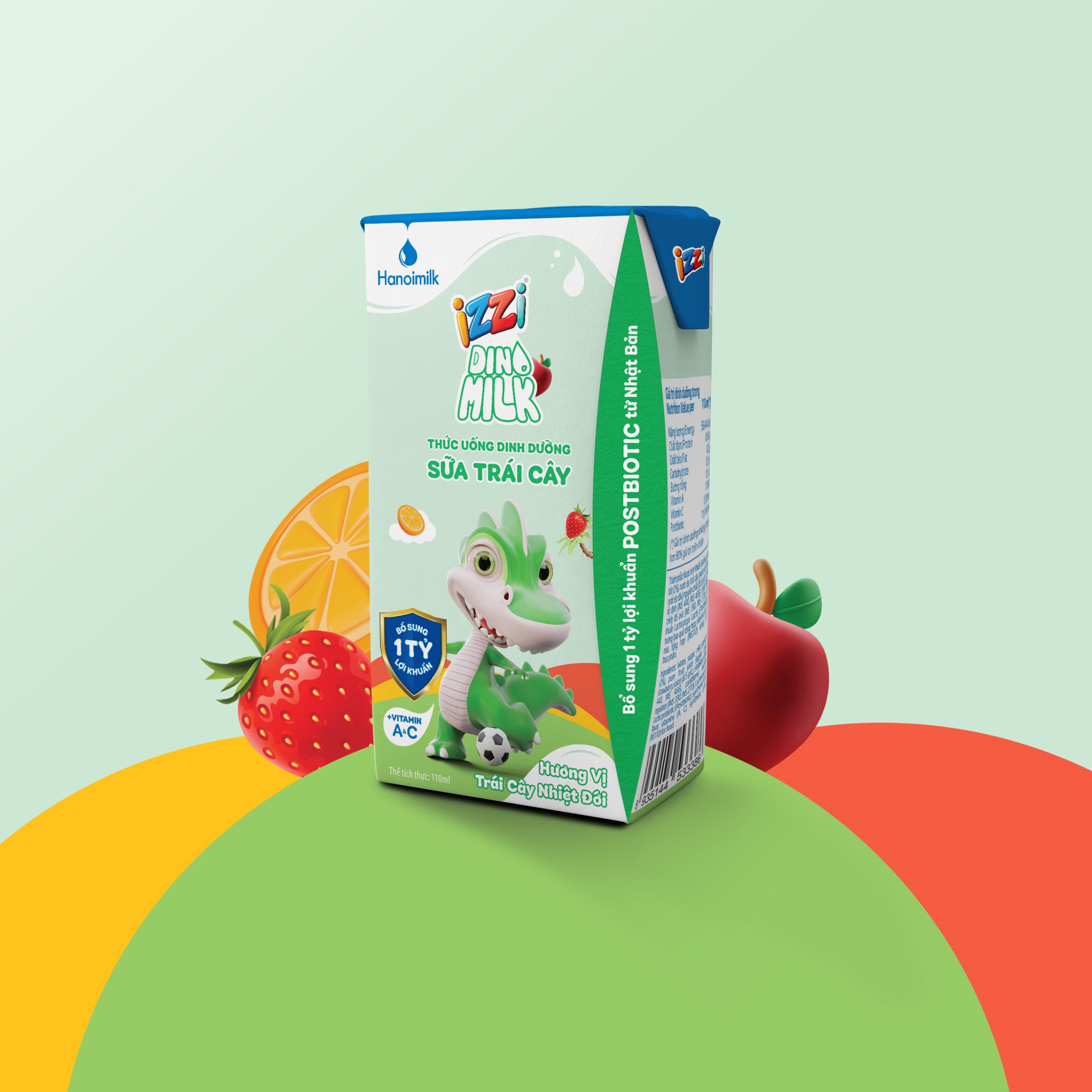
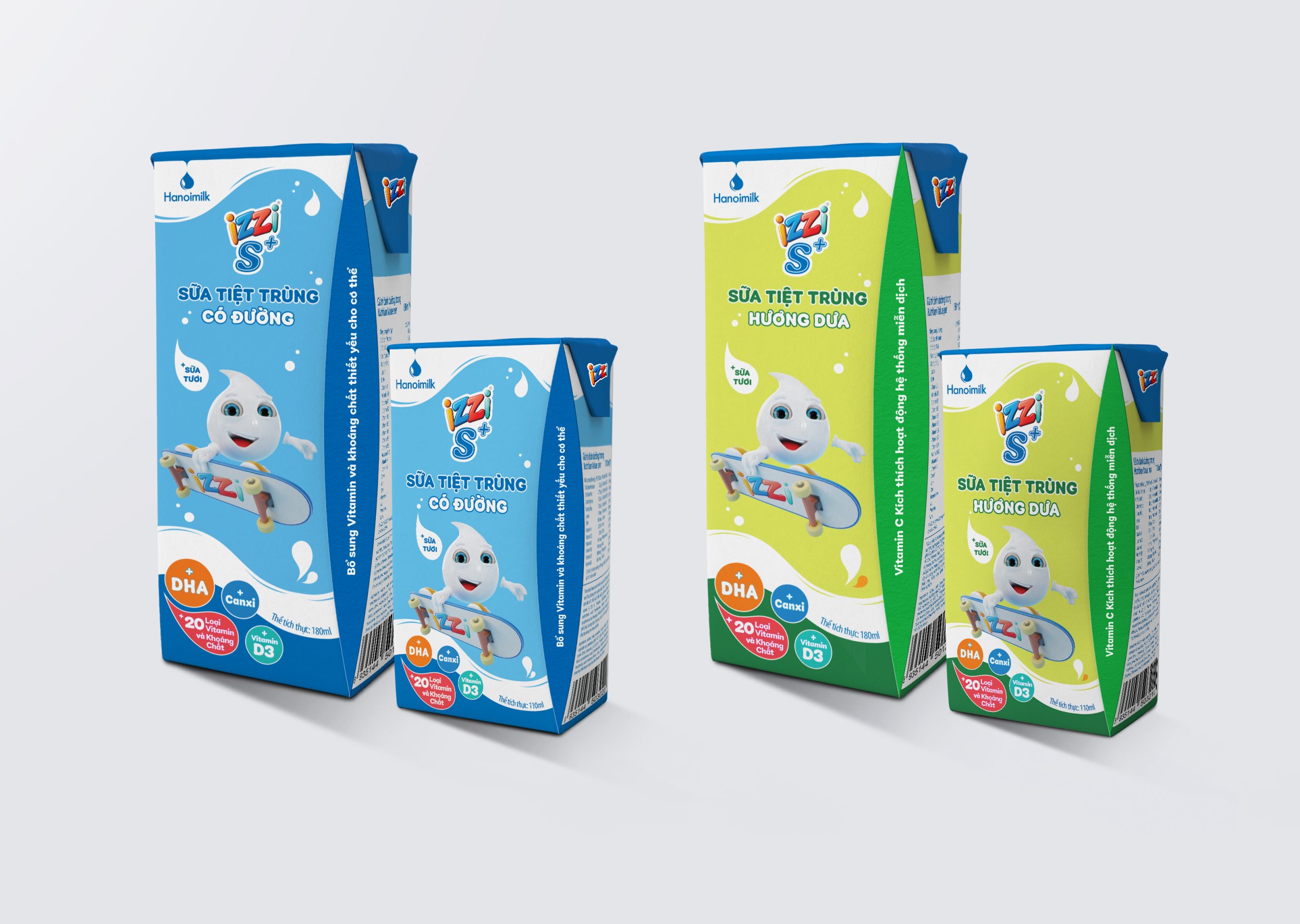
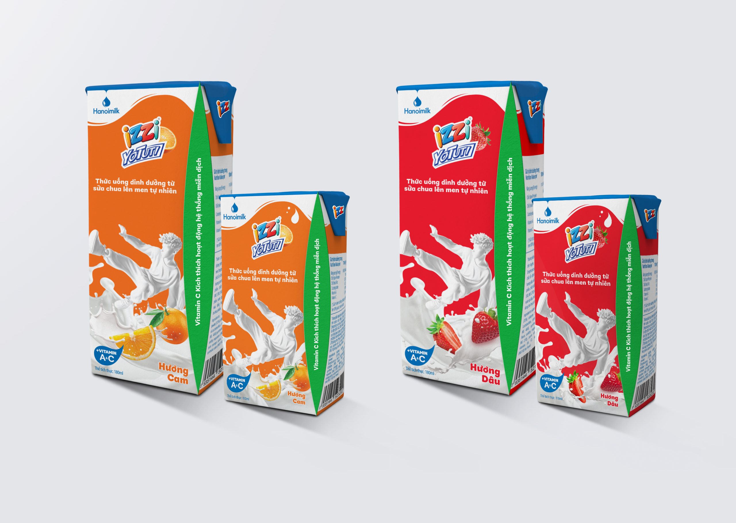
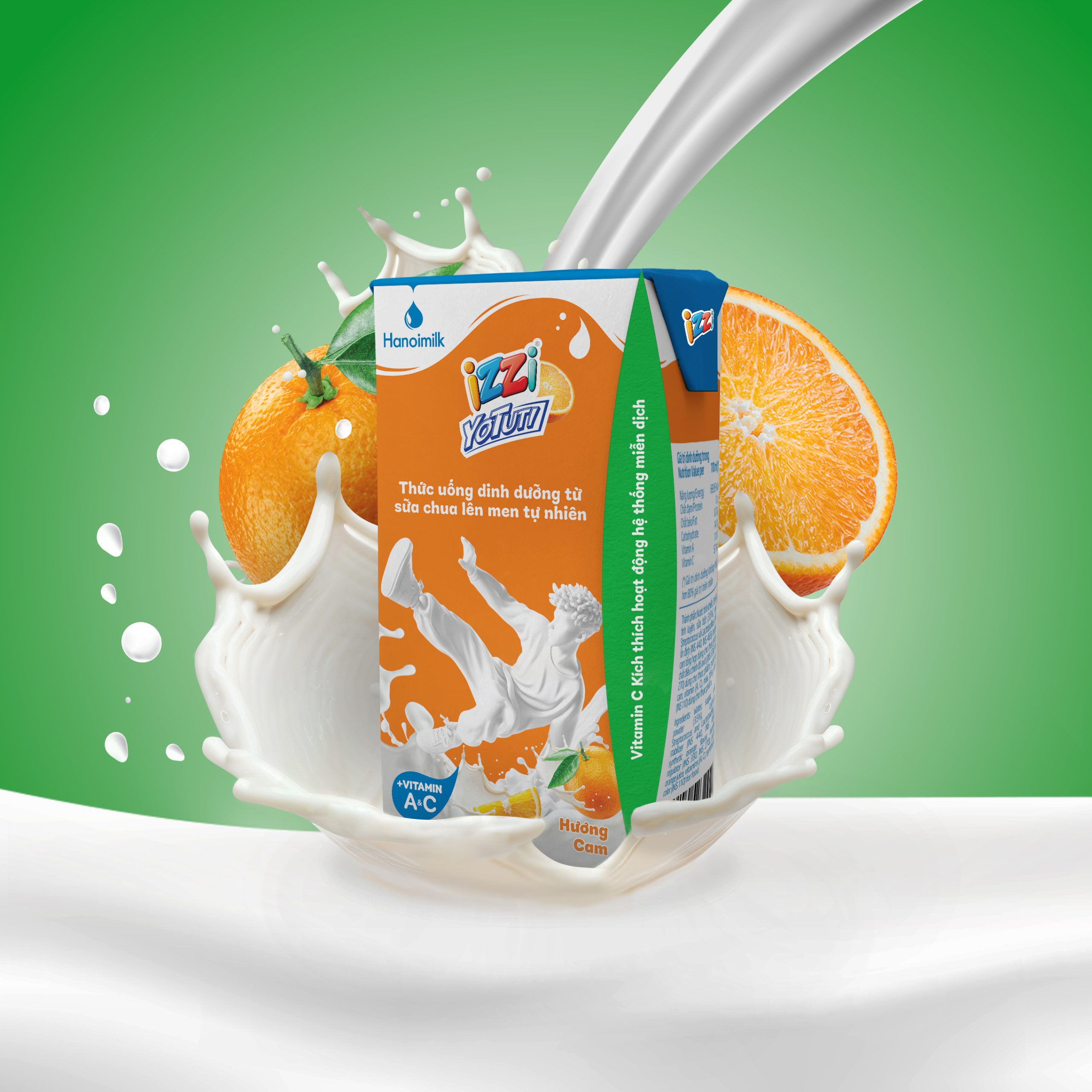
The device that holds them together is a flowing brand flag: a single graphic form carrying the Hanoimilk logo, positioned identically on every pack. It’s the fixed point. Everything above and below it is allowed to change completely.
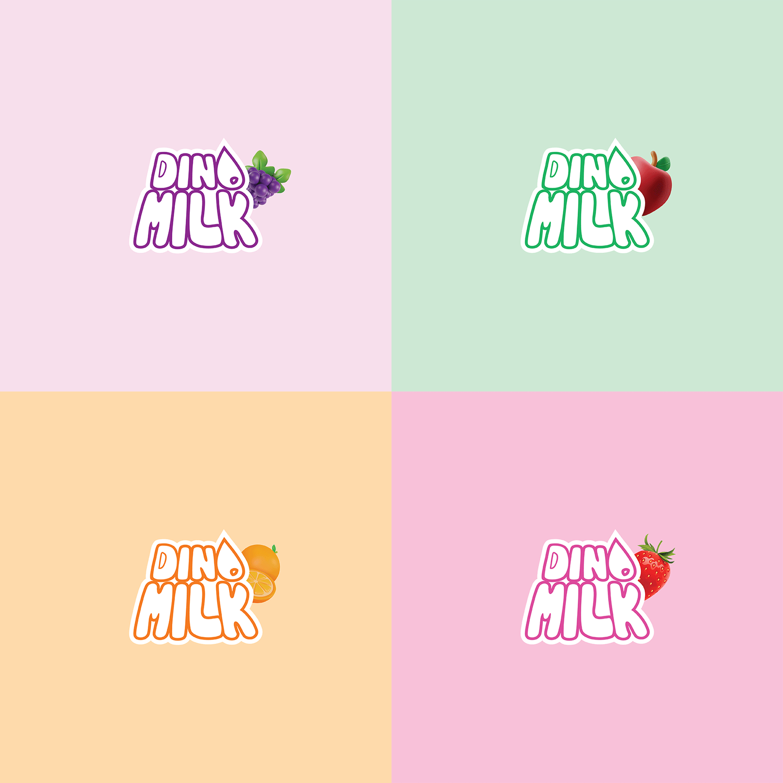
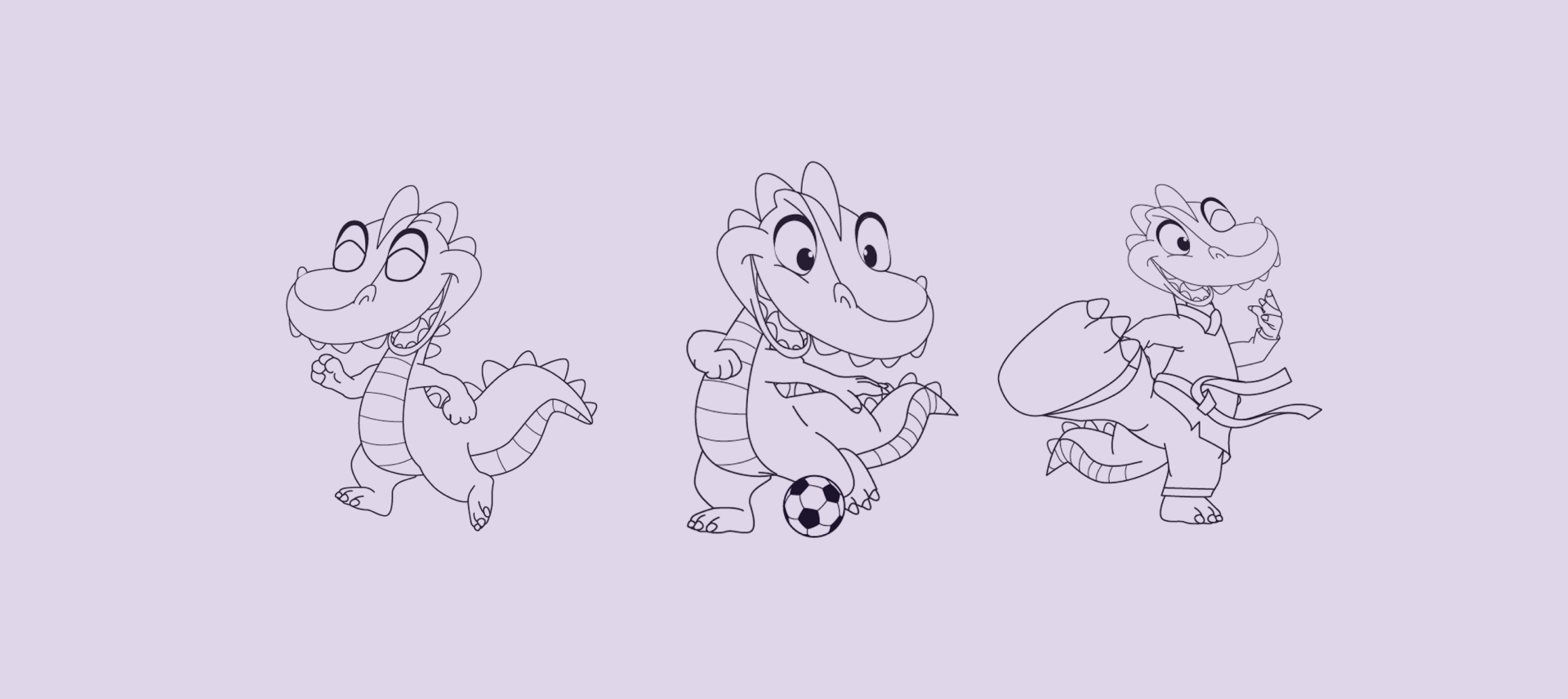
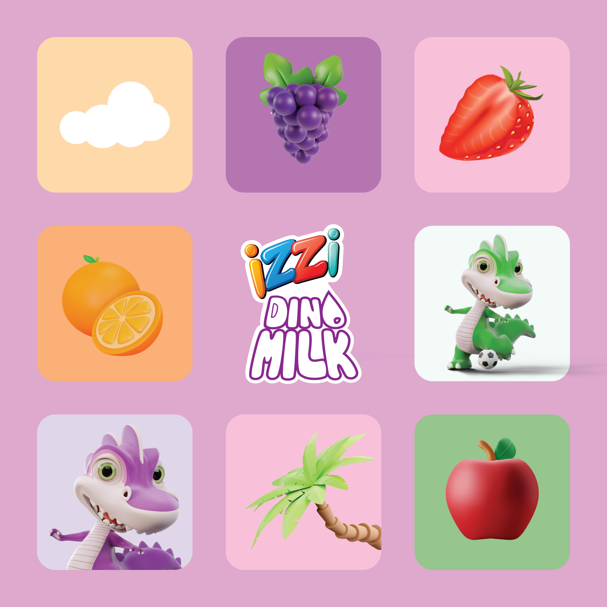
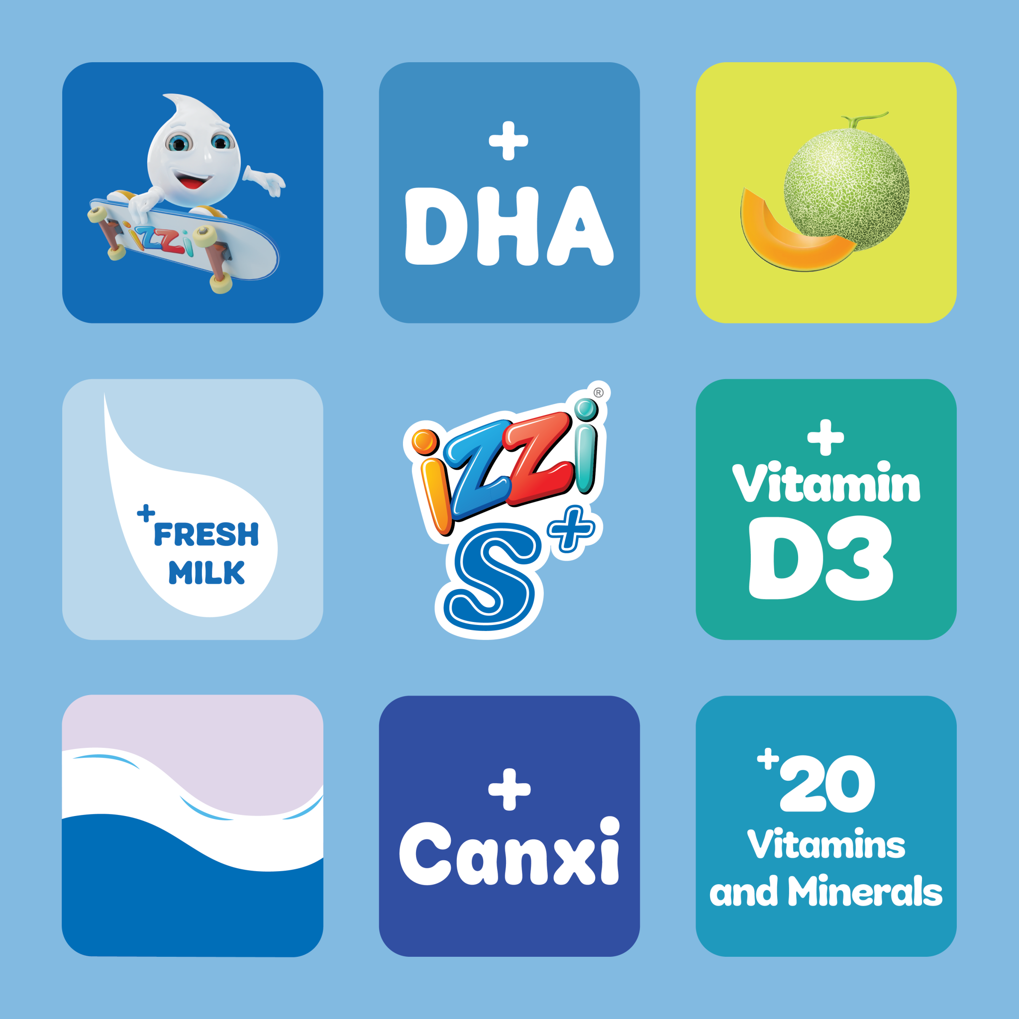
Which is what makes the colour coding work. Each line takes its own palette and its own illustration style, pitched at its own audience, with no attempt to harmonise between them because a five-year-old choosing Dinomilk and an adult choosing ChocoOats are not looking for the same signals. The flag is what stops that variety reading as four unrelated brands.
It’s brand architecture solved graphically rather than structurally: one recurring element doing the work that a rigid template would have done badly.
Client Hanoimilk
Location Vietnam
Scope Packaging design · Brand architecture · Logo design · Illustration · Colour system
Sector FMCG and dairy packaging design