HALO
The primary entertainment venue inside a nine-outlet casino at Swissôtel Clark a circular bar that had to read as the destination among eight competitors under the same roof.
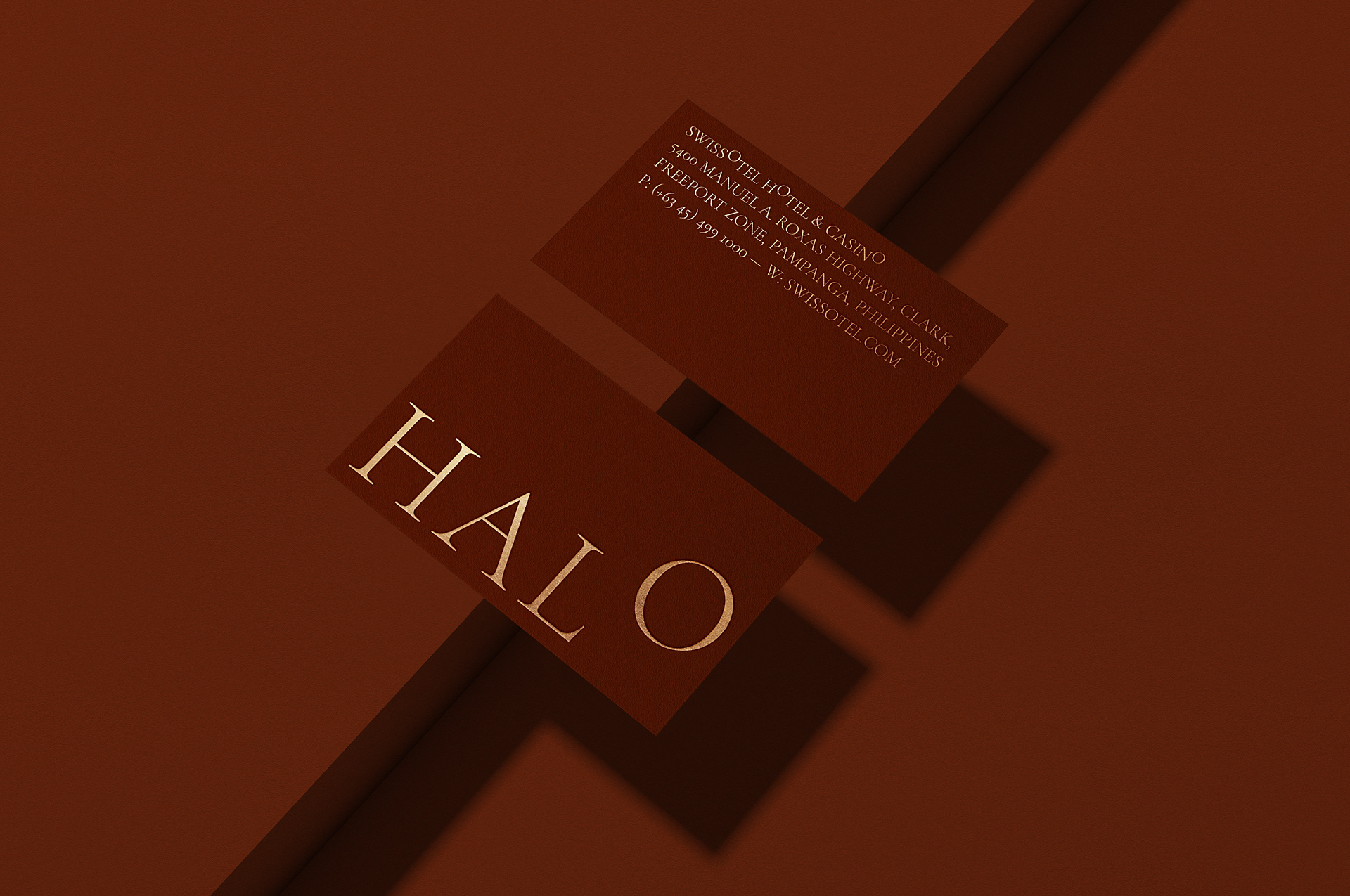
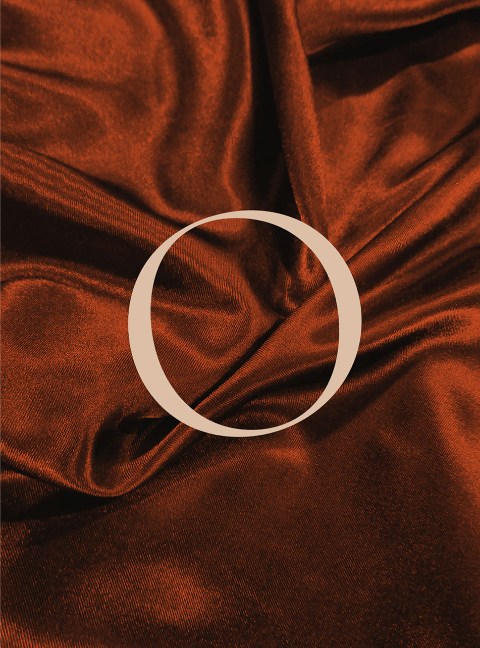
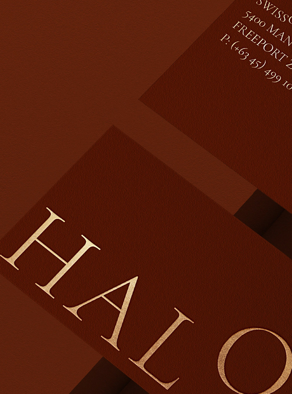
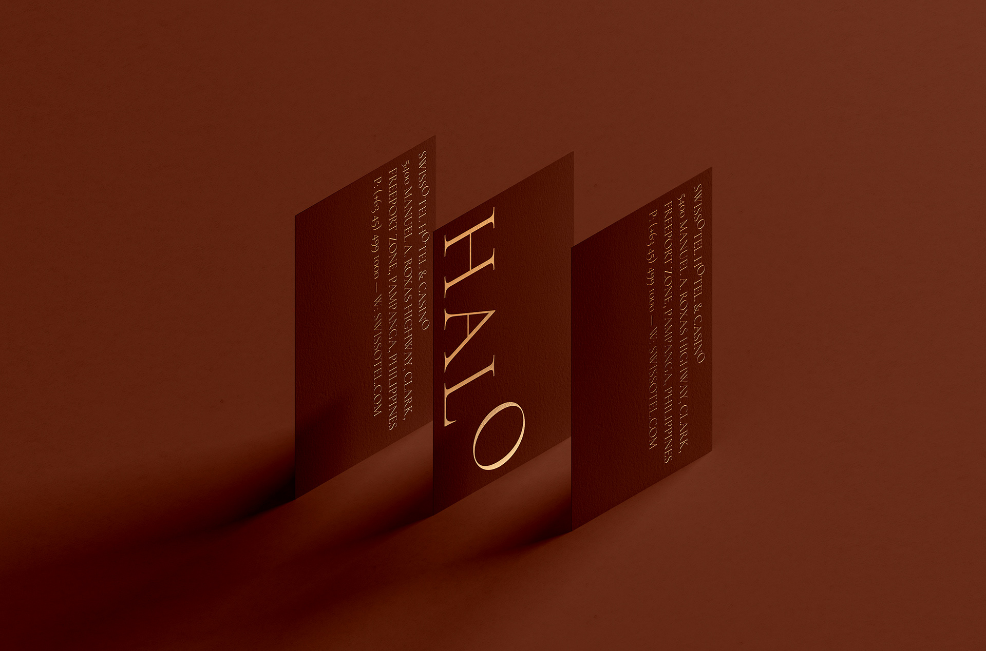
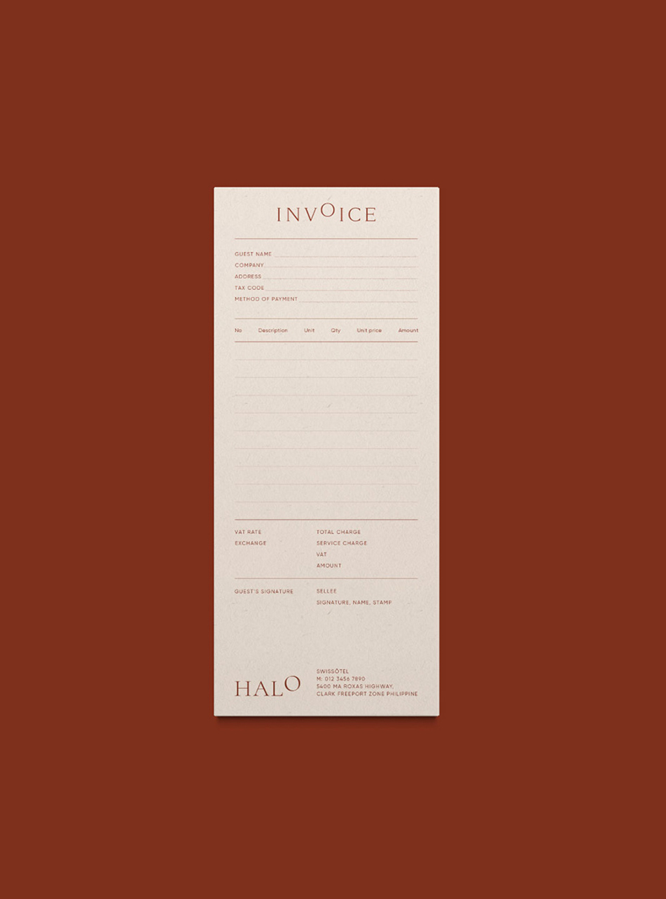
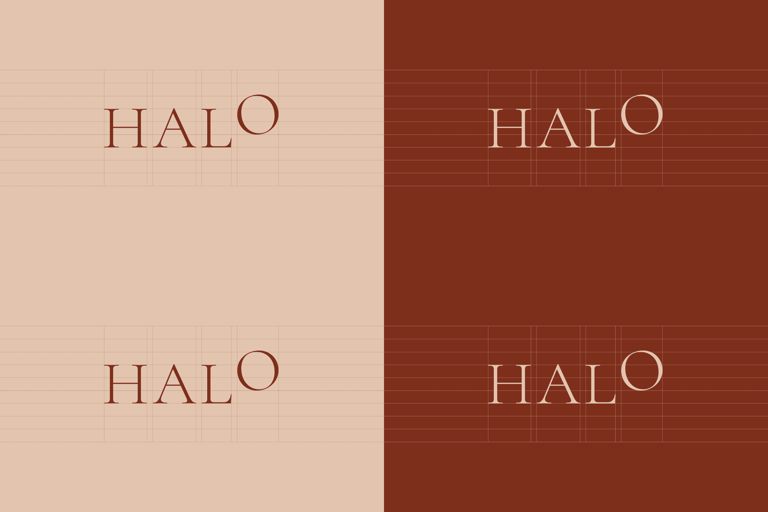
The name arrived first, and the identity is built from a single letter in it. In HALO, the O is drawn as a perfect circle while the other three characters keep their normal proportions. It sits slightly too round against them, and that small wrongness is the whole brand: a ring, a halo, a light source.
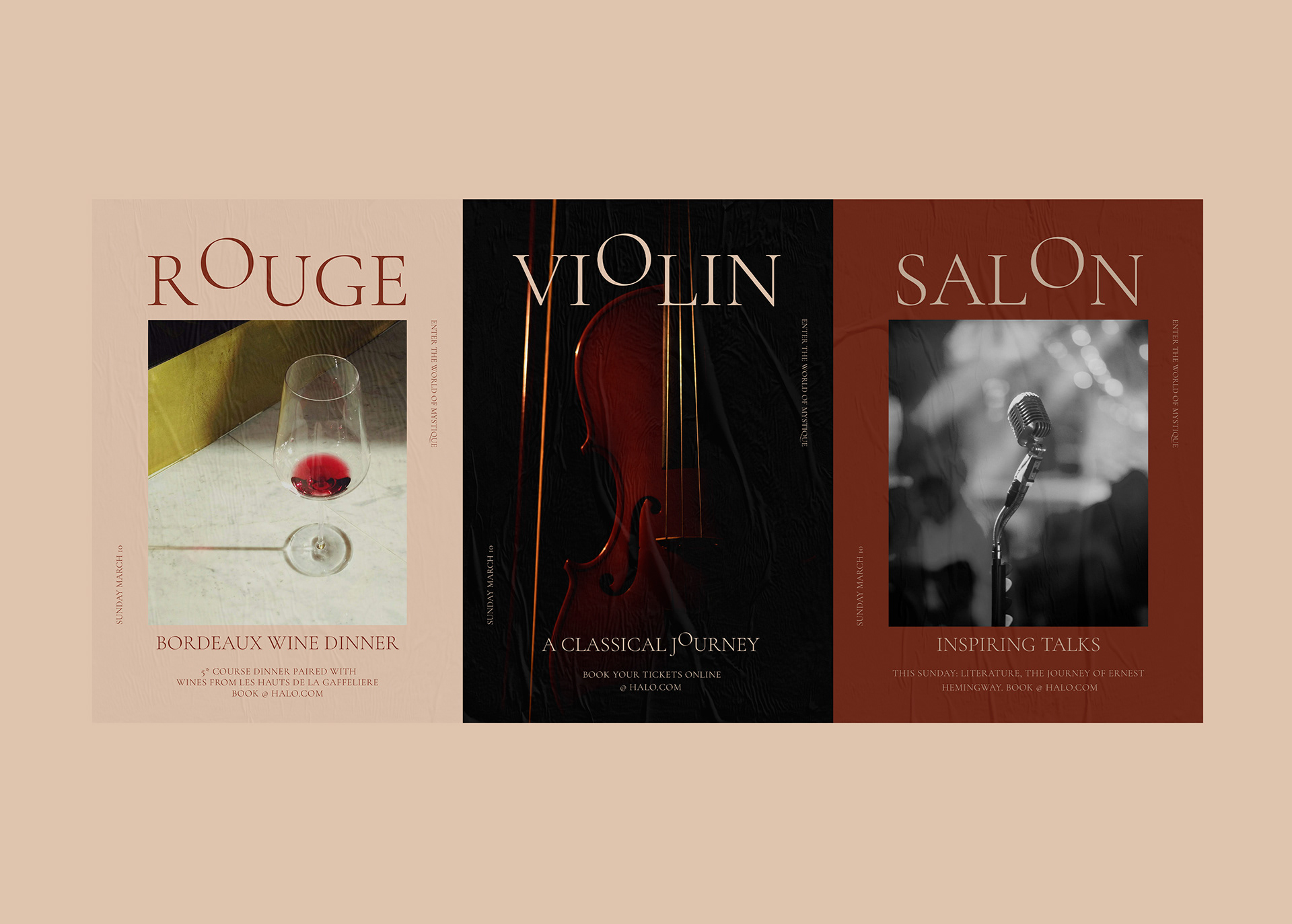
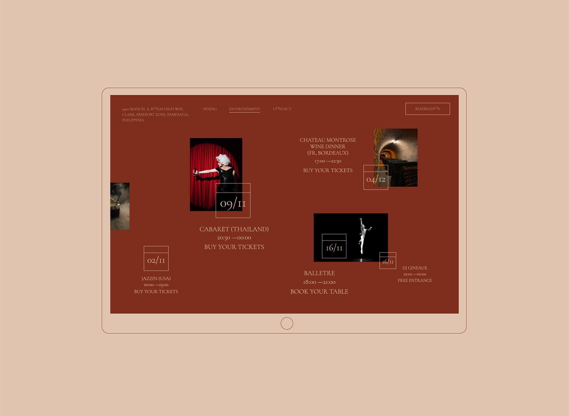
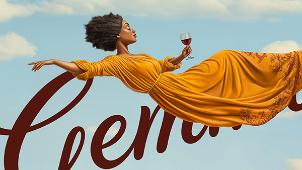
That letterform then becomes a system. Across the event programme ROUGE, VIOLIN, SALON the O in every title is swapped for the same perfect circle, so a poster is branded before the logo appears on it. Wine dinners, cabaret, classical recitals: different content, one recurring mark.
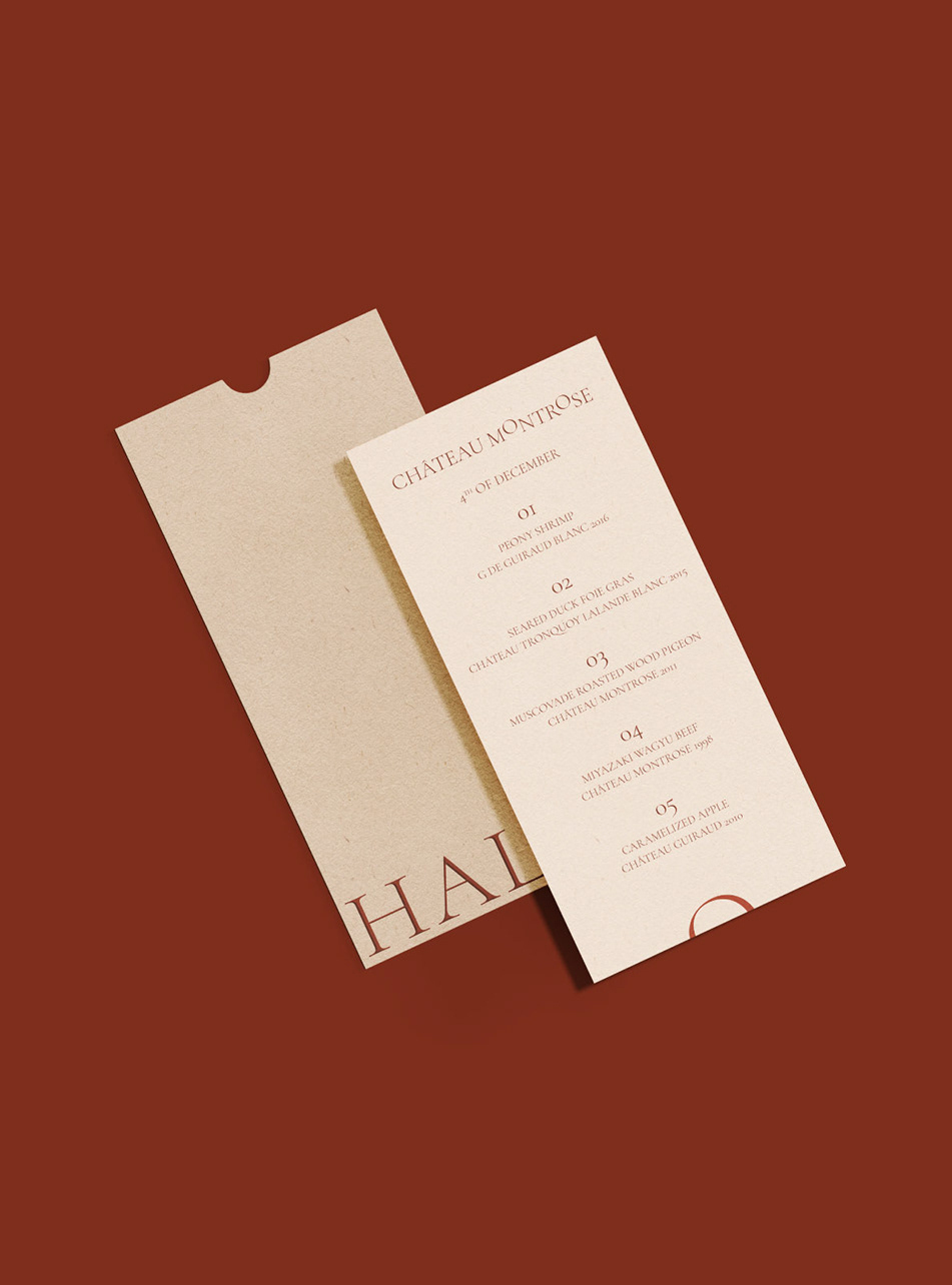
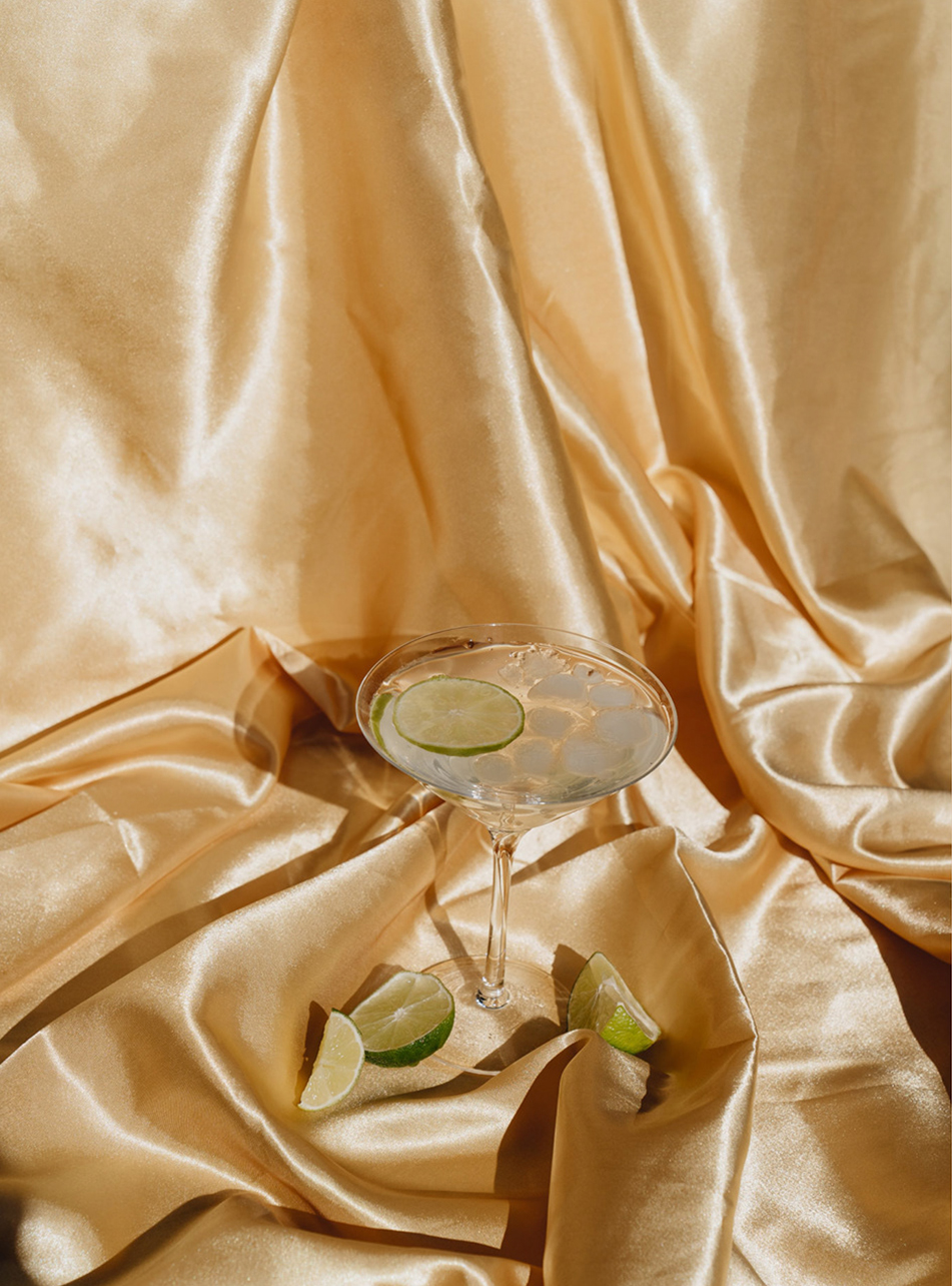
Everything else stays quiet. Burnt sienna, gold foil, deep-textured uncoated stock, and a palette that lets the room’s lighting do the work. In a casino, restraint is the loudest available signal.
Client Hann Lux Swissôtel Hotel & Casino, Clark
Location Pampanga, Philippines
Scope Bar naming · Brand identity · Wordmark design · Event campaign design · Website design
Sector Casino and entertainment venue branding