Aura by Mövenpick
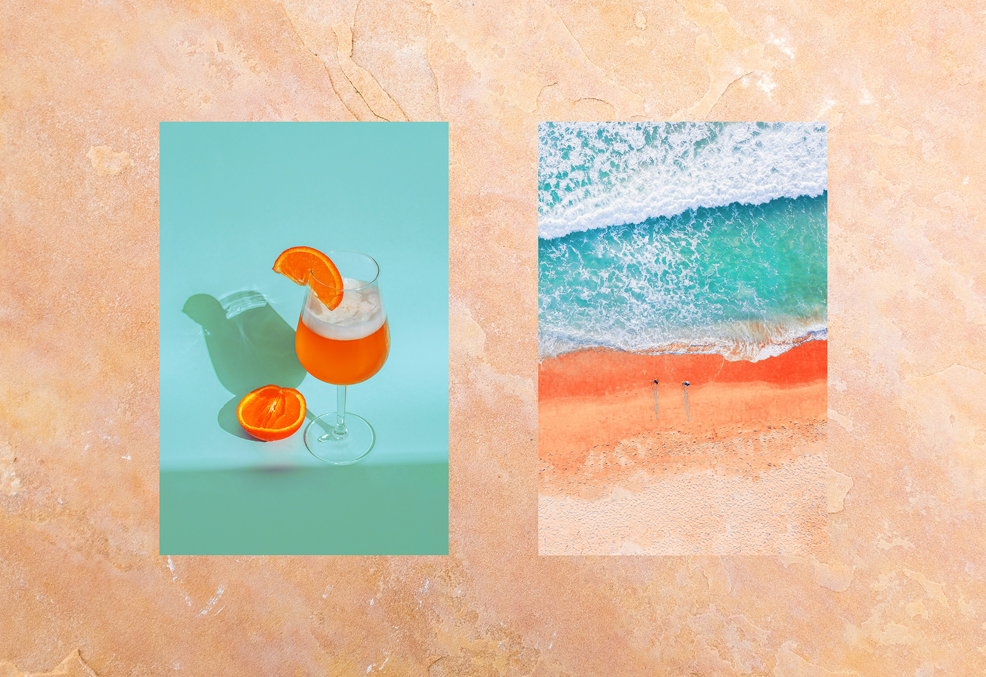
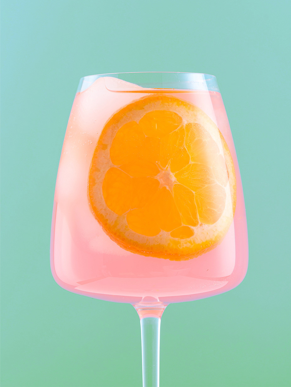
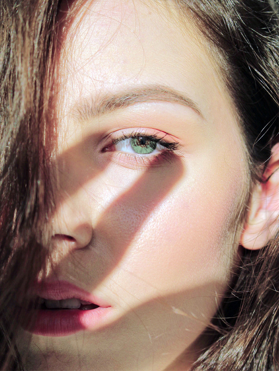
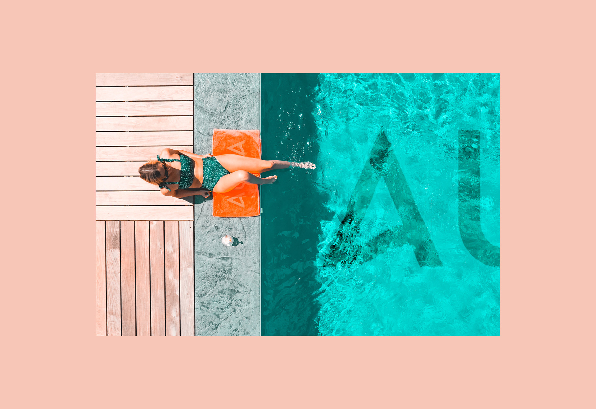
A beach club on Phu Quoc tapas and fresh juice by day, music and cocktails after dark. One identity with two completely different moods.
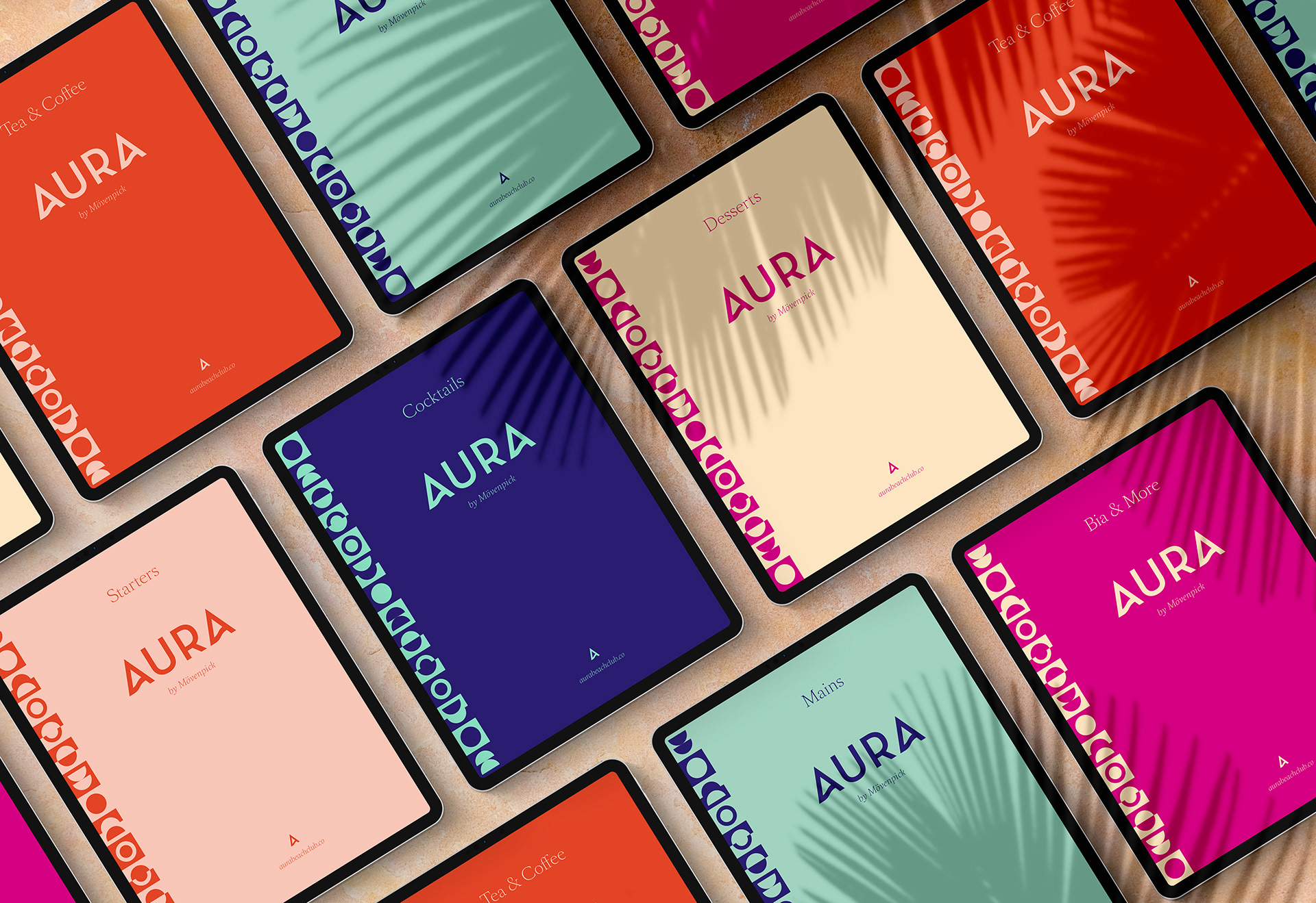
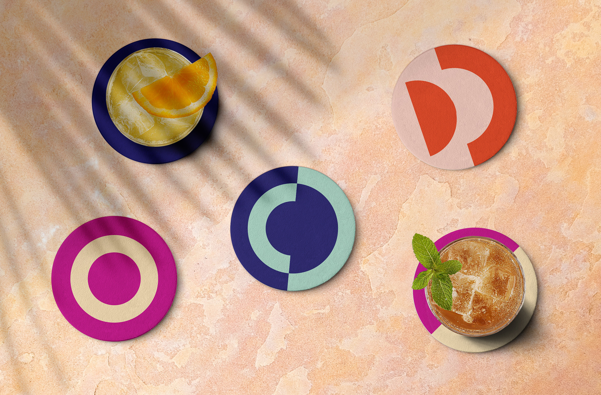
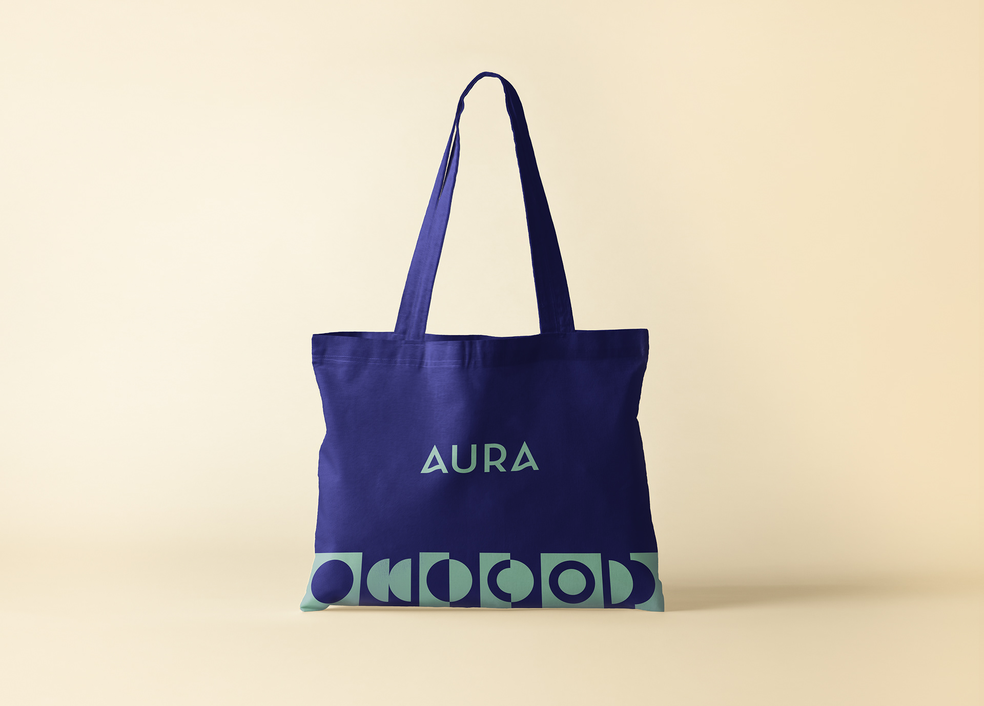
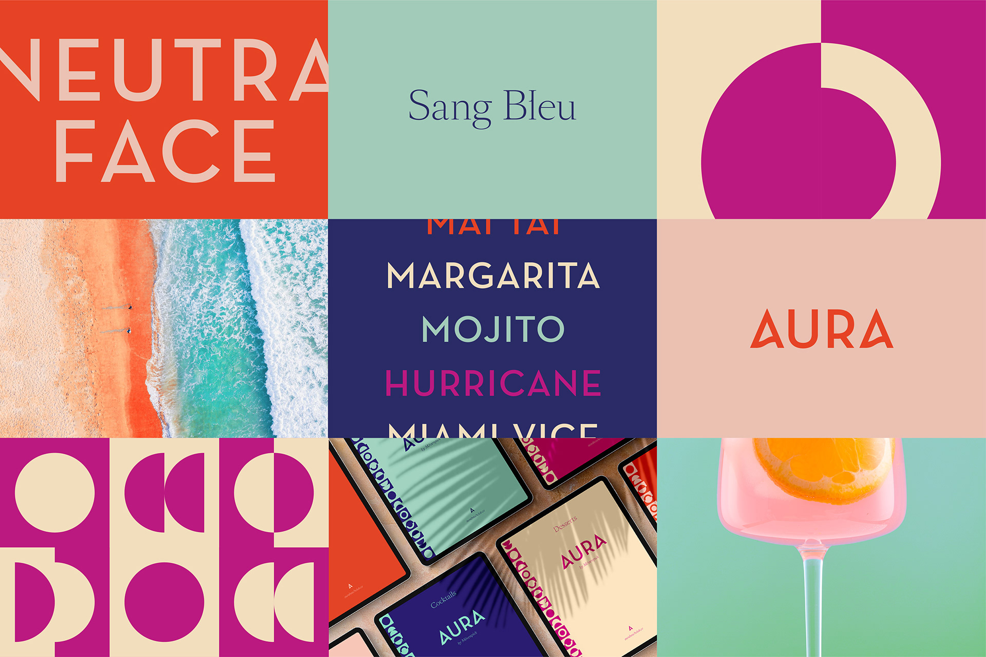
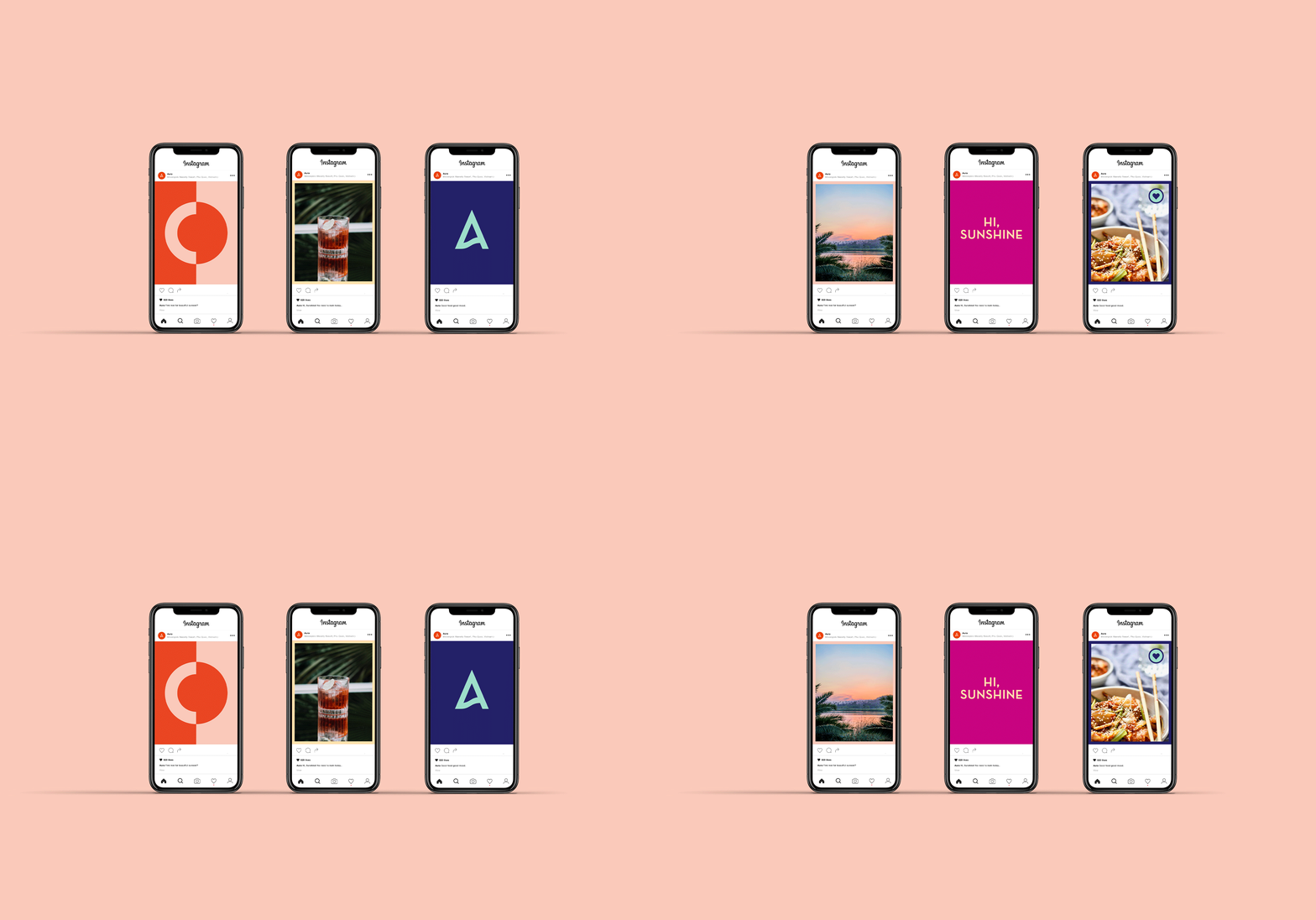
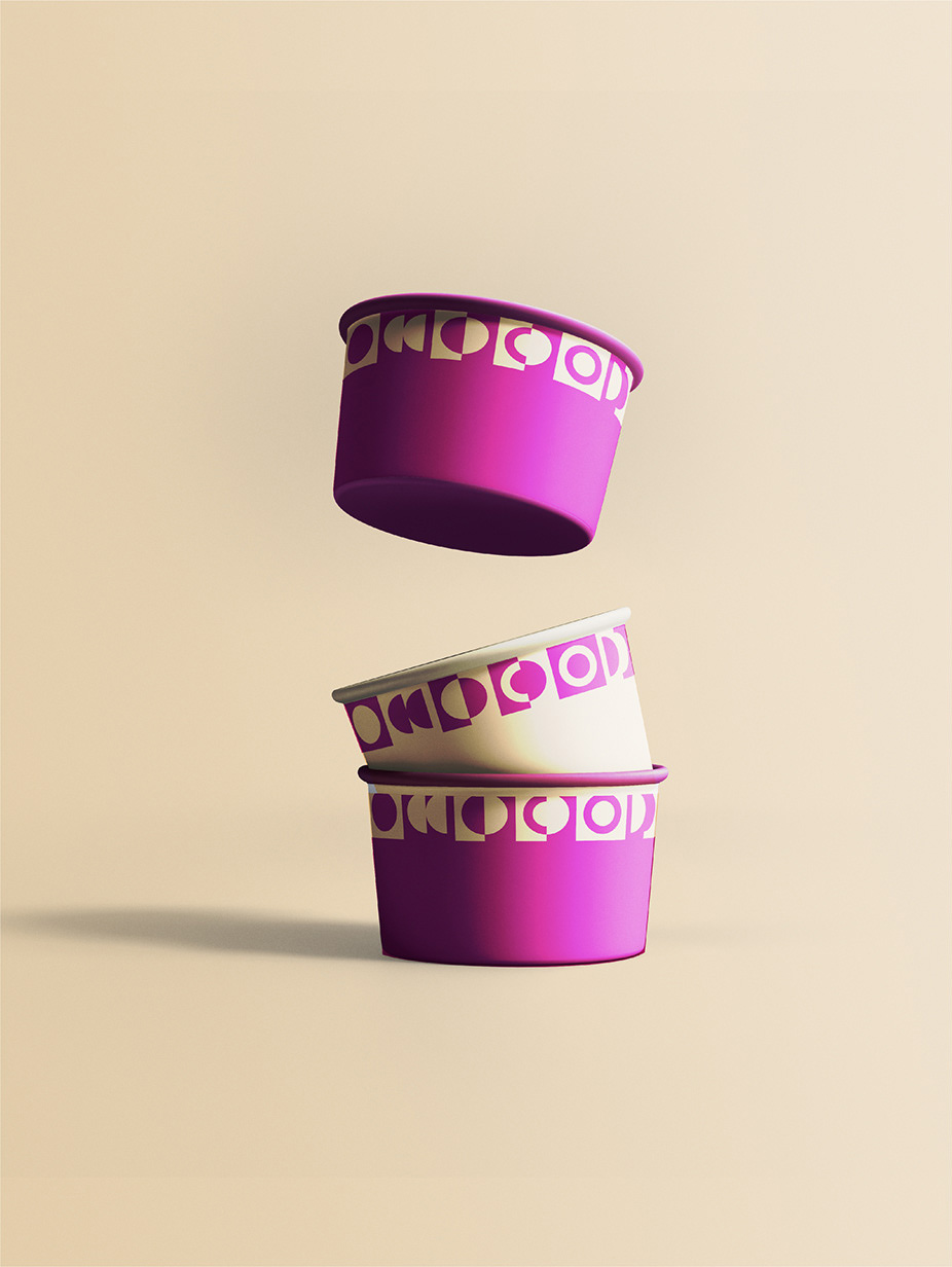
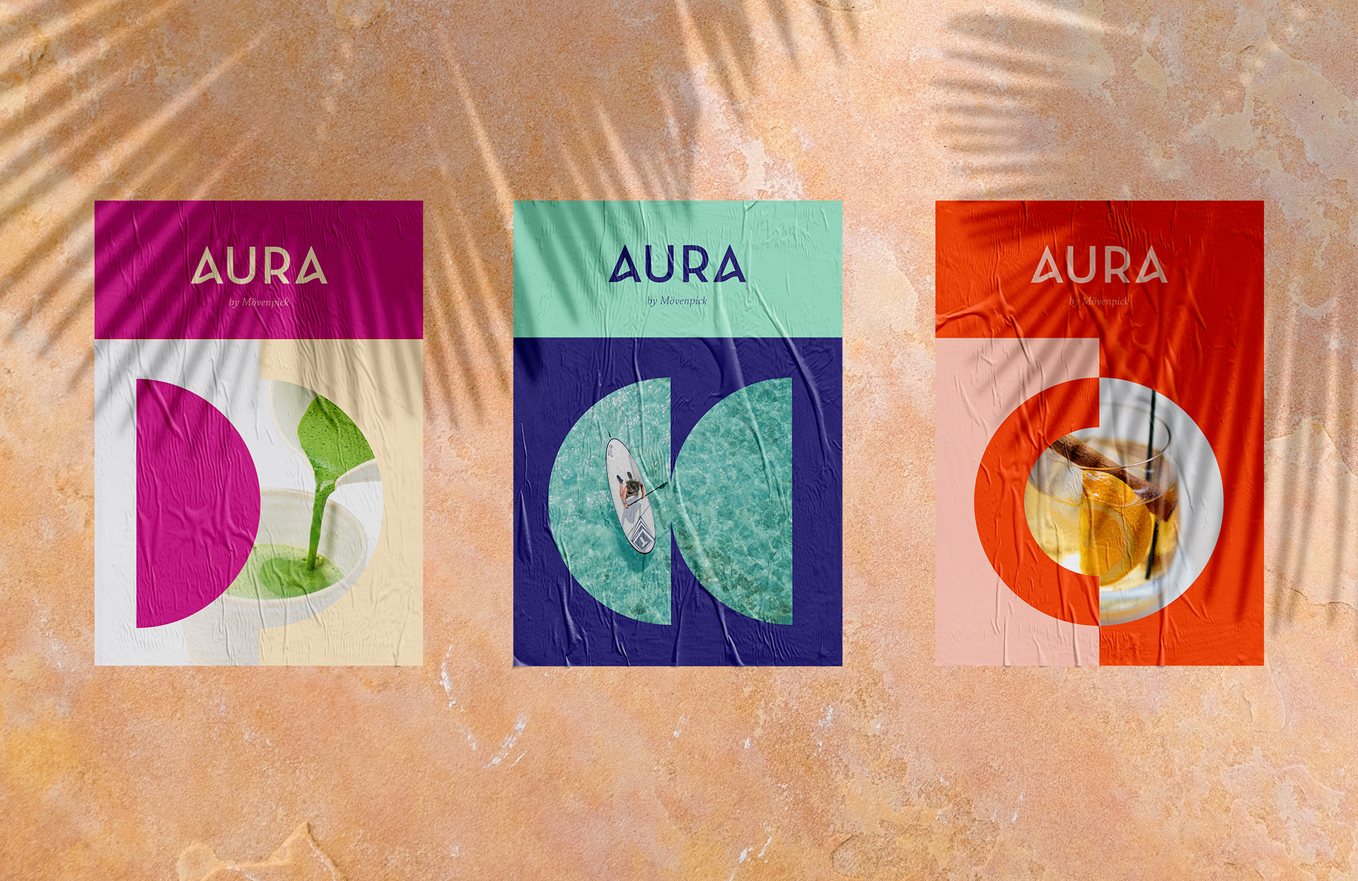
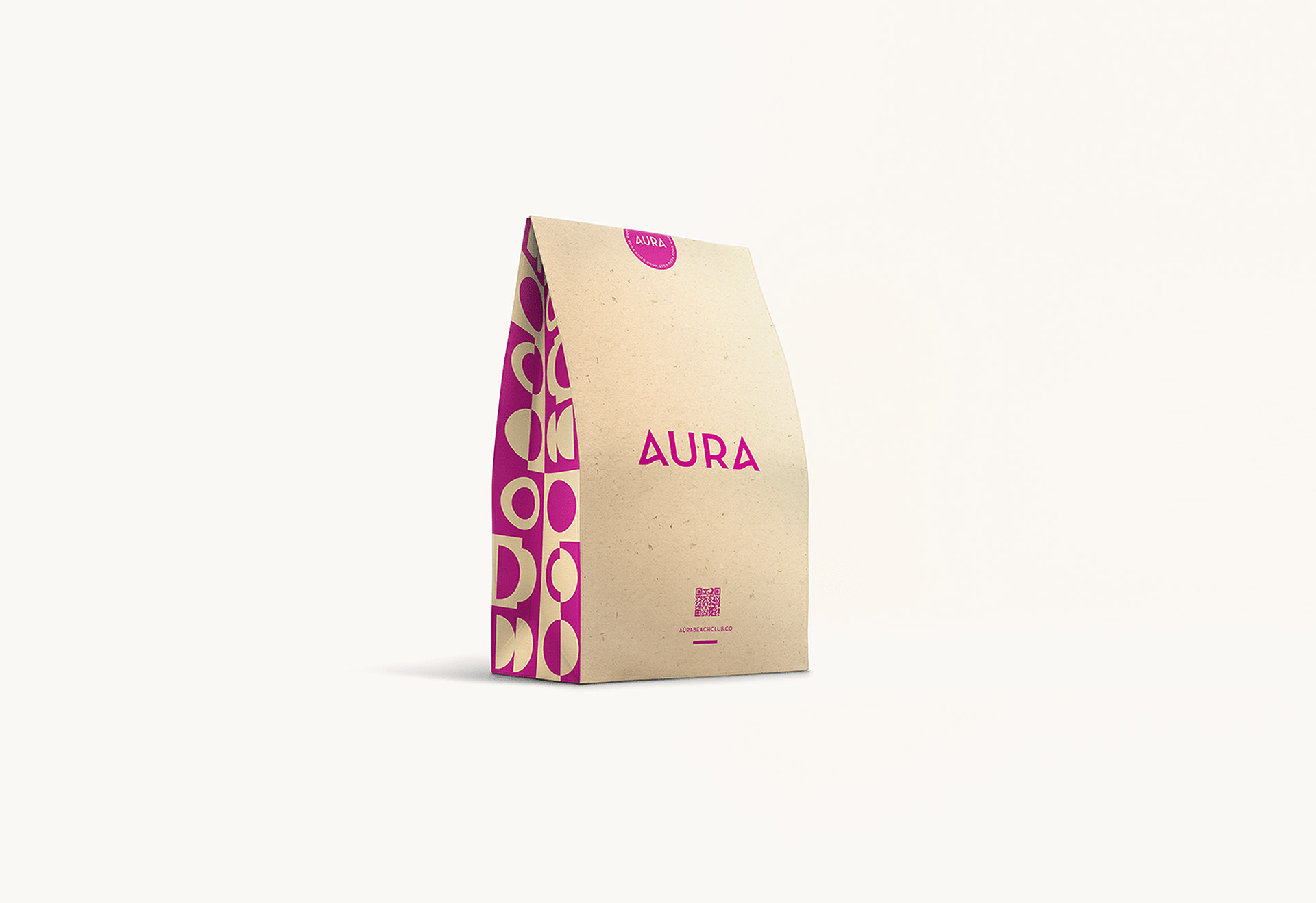
The solution is a pattern rather than a palette. The graphic system is built from lunar phases: a repeating border of circles filled, halved, crescented and empty, running as a strip along every menu cover and cropping into single circles on the coasters. The moon is visible from anywhere on the site, and it changes the place as it moves so the identity changes with it rather than trying to be two things at once.
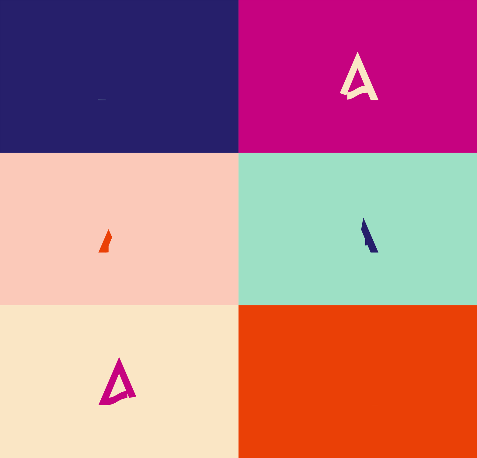
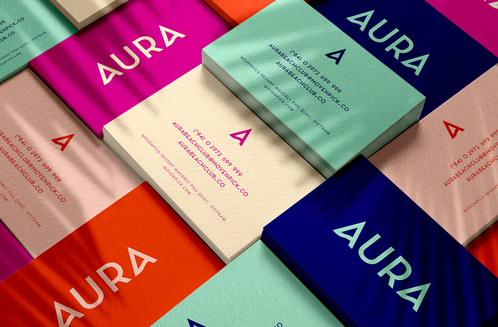
The wordmark takes the same logic into one letter. The A in AURA is drawn with a curved apex, a wave shape sitting inside otherwise open, geometric capitals.
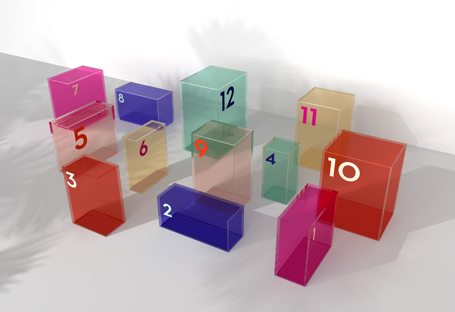
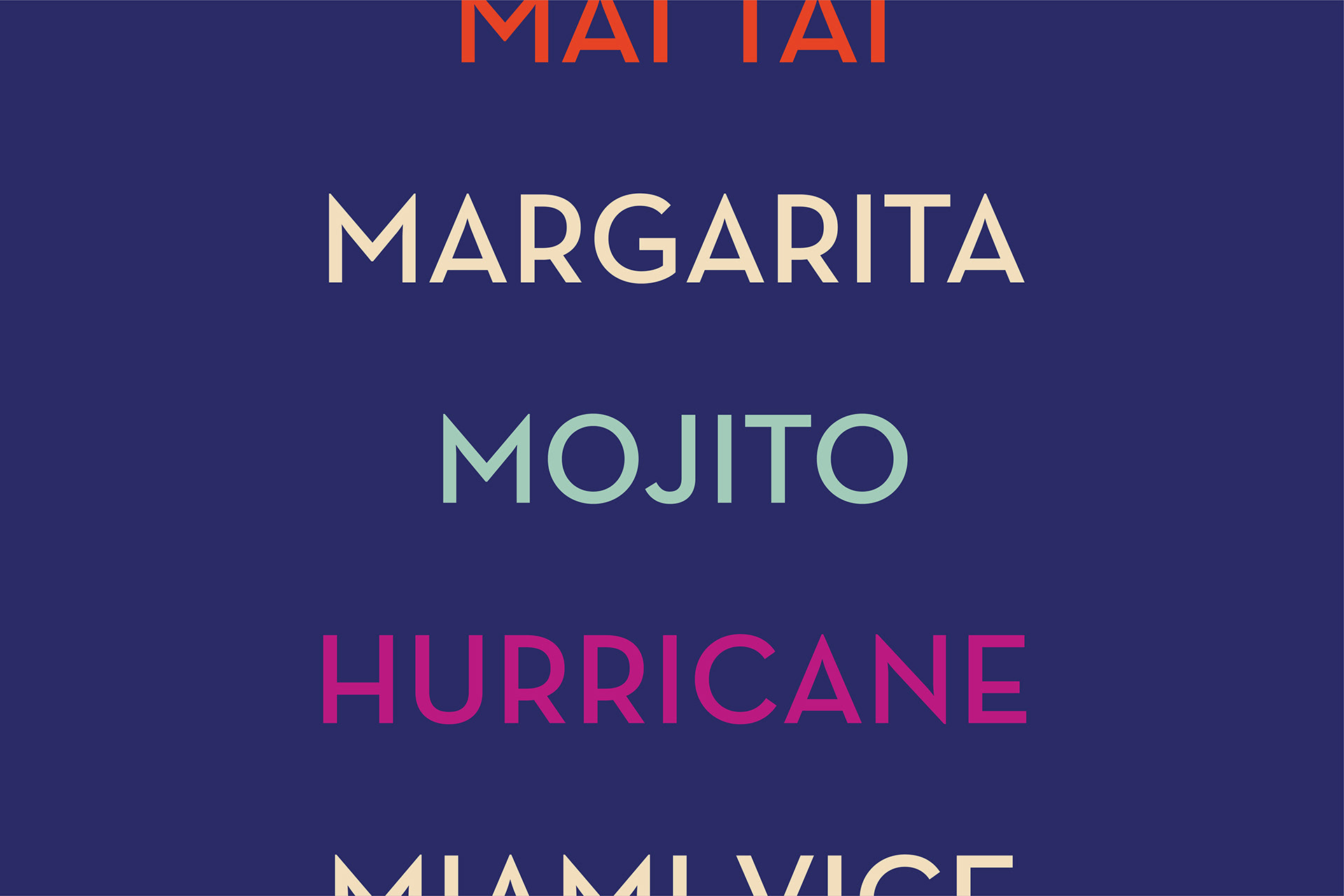
Colour is where the two moods live: bright primaries cobalt, scarlet, magenta for full party mode, and the same layouts in pastel mint, blush and sand for daytime. Identical system, different volume.
Client Accor Mövenpick Resort Waverly Phu Quoc
Location Phu Quoc, Vietnam
Scope Bar naming · Brand identity · Brand strategy · Menu design · Packaging
Sector Beach club and resort F&B branding