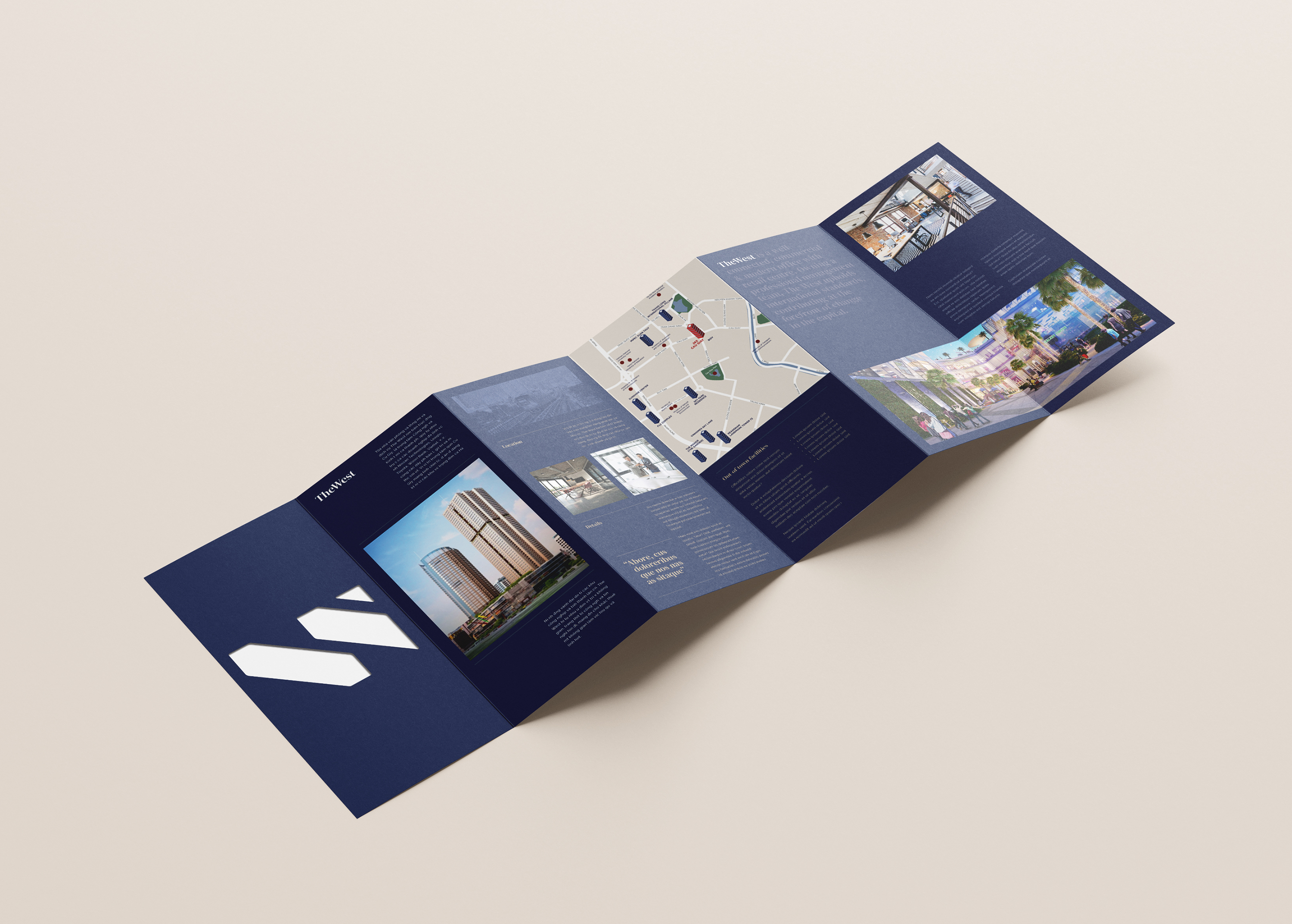
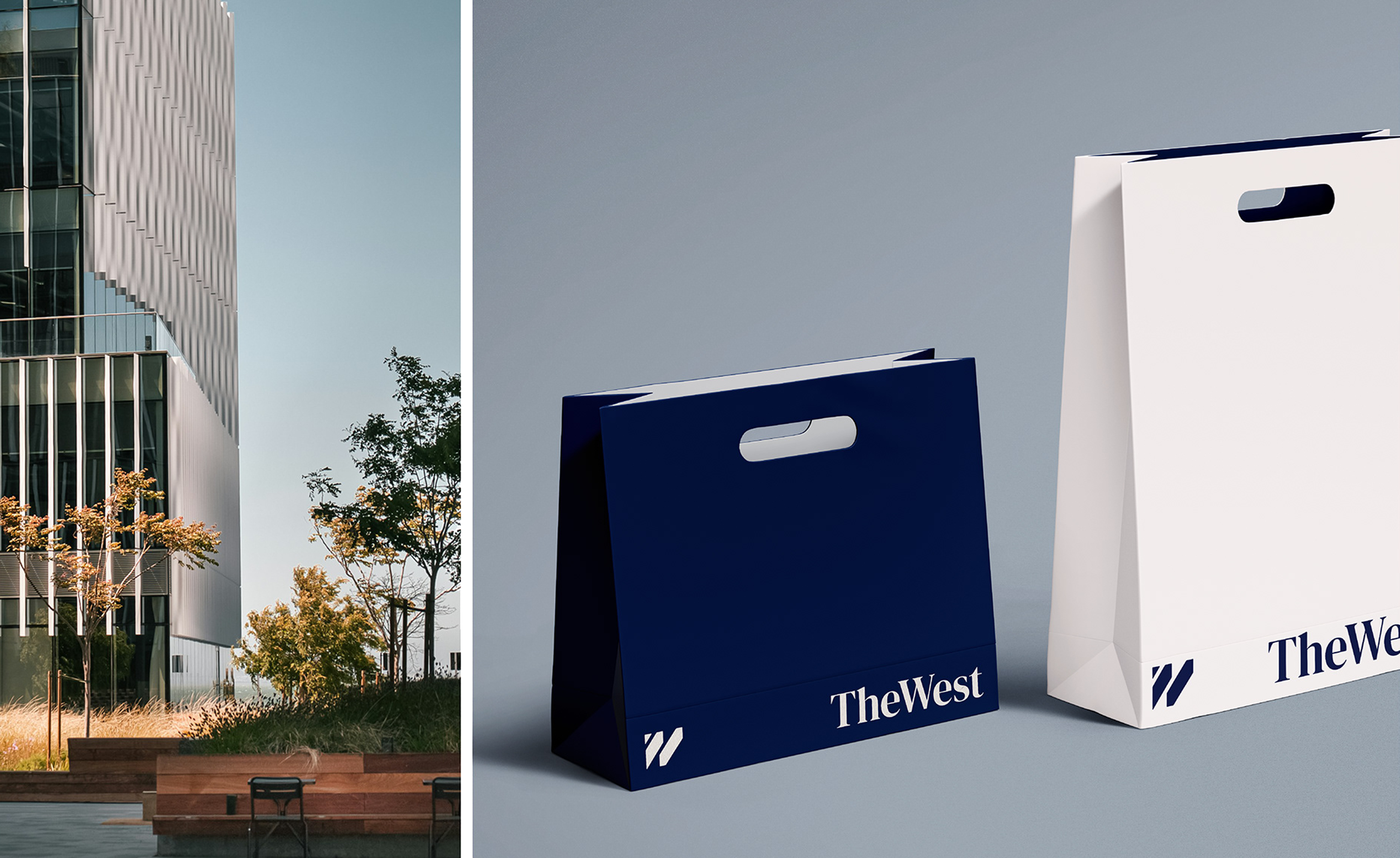
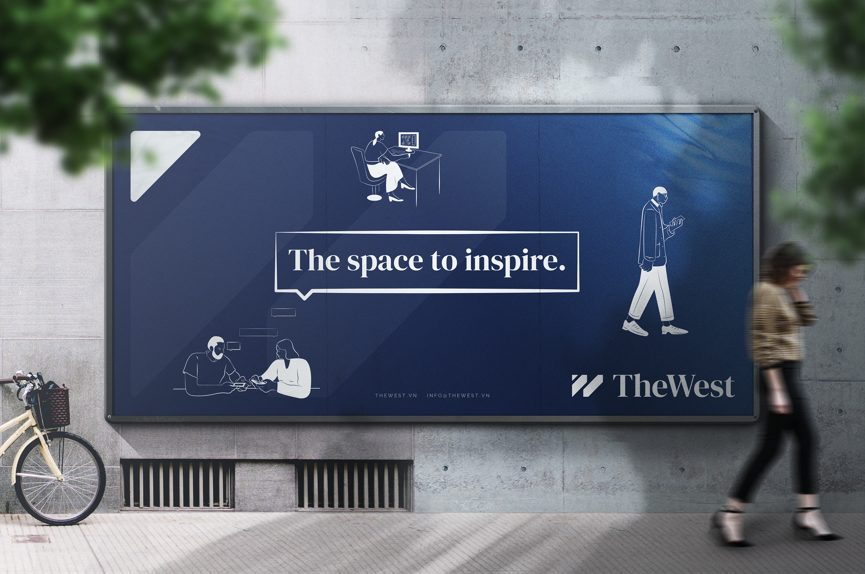
The West
Until 2022 this office and retail tower in Hanoi’s Cầu Giấy District was Bamboo Airways Tower an airline’s name on a building. After its acquisition by Gateway Hanoi, it needed an identity that belonged to the building and the district, not to whichever company happened to be leasing the name.
The new name settles that by pointing at the map. The West names the building’s actual position the western edge of Hanoi, the gateway into that side of the city which gives it a claim no invented word could match.
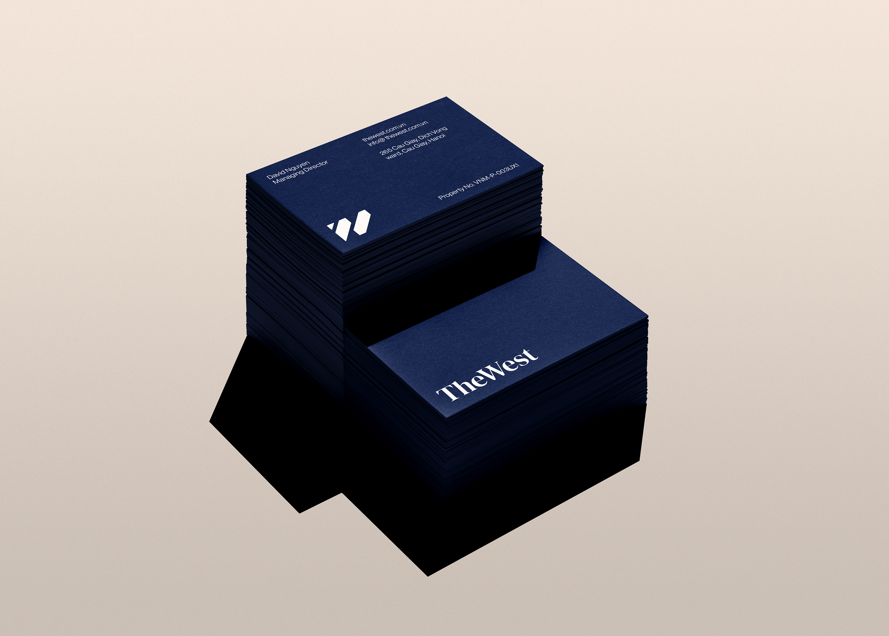
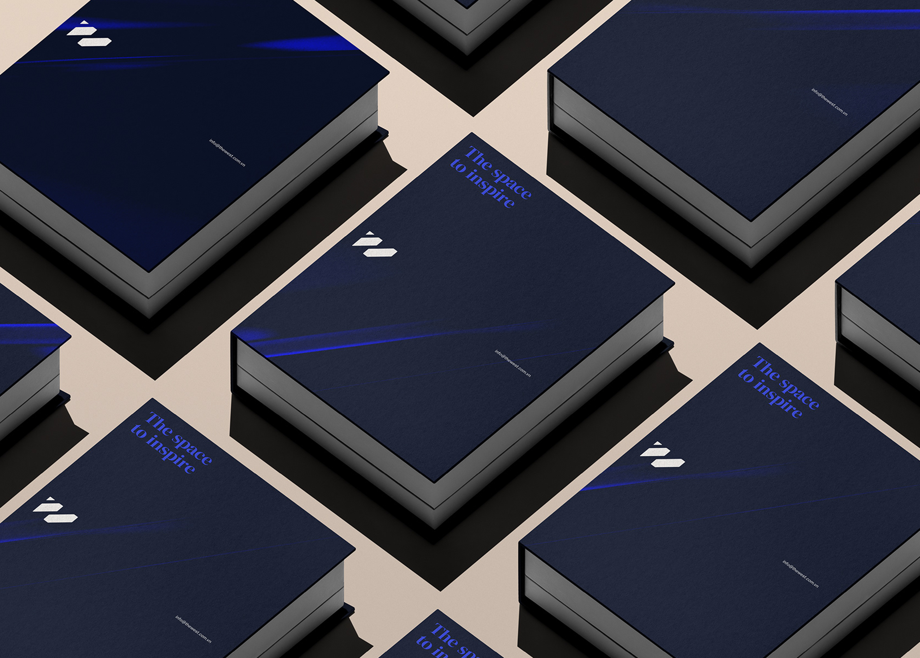
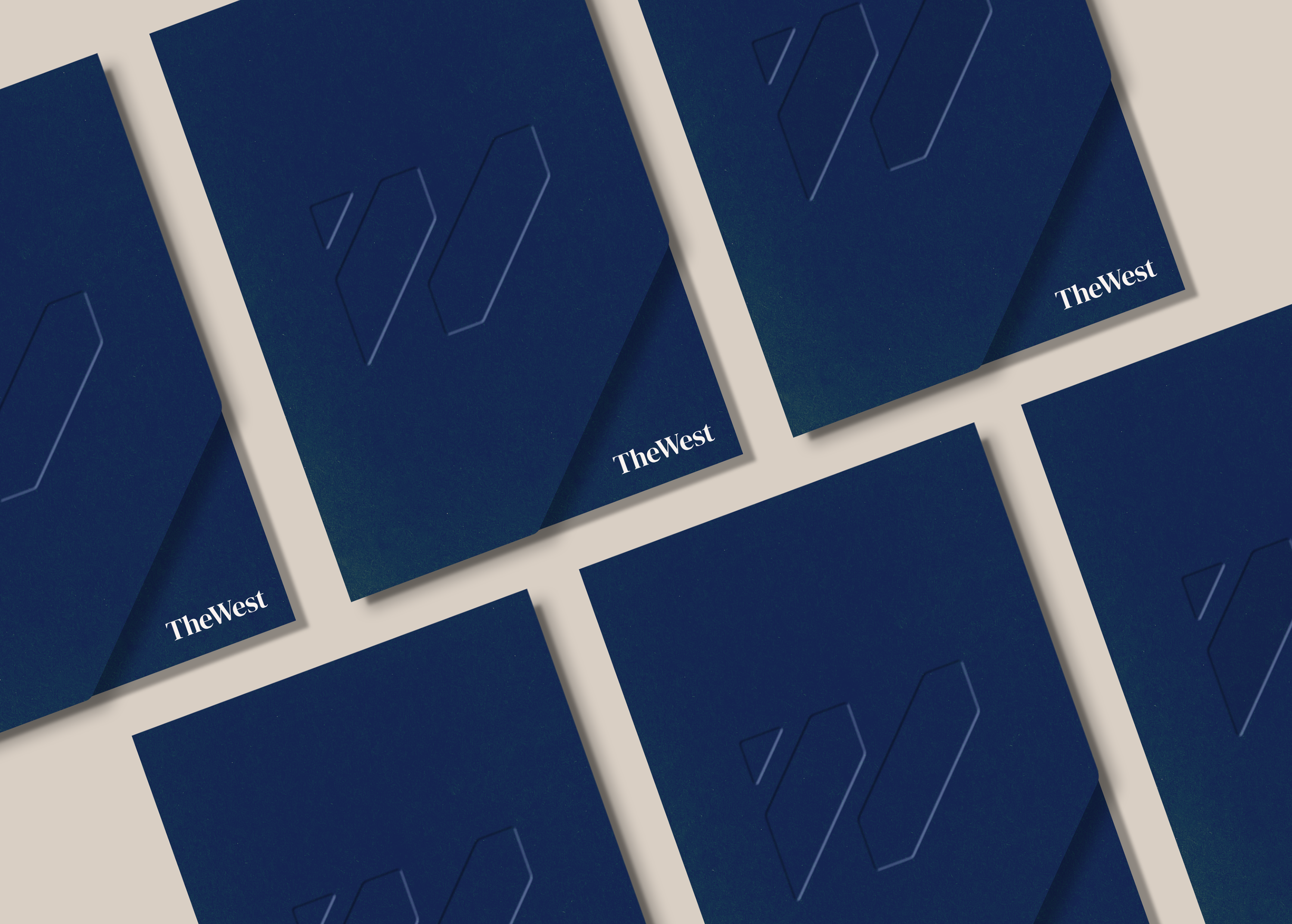
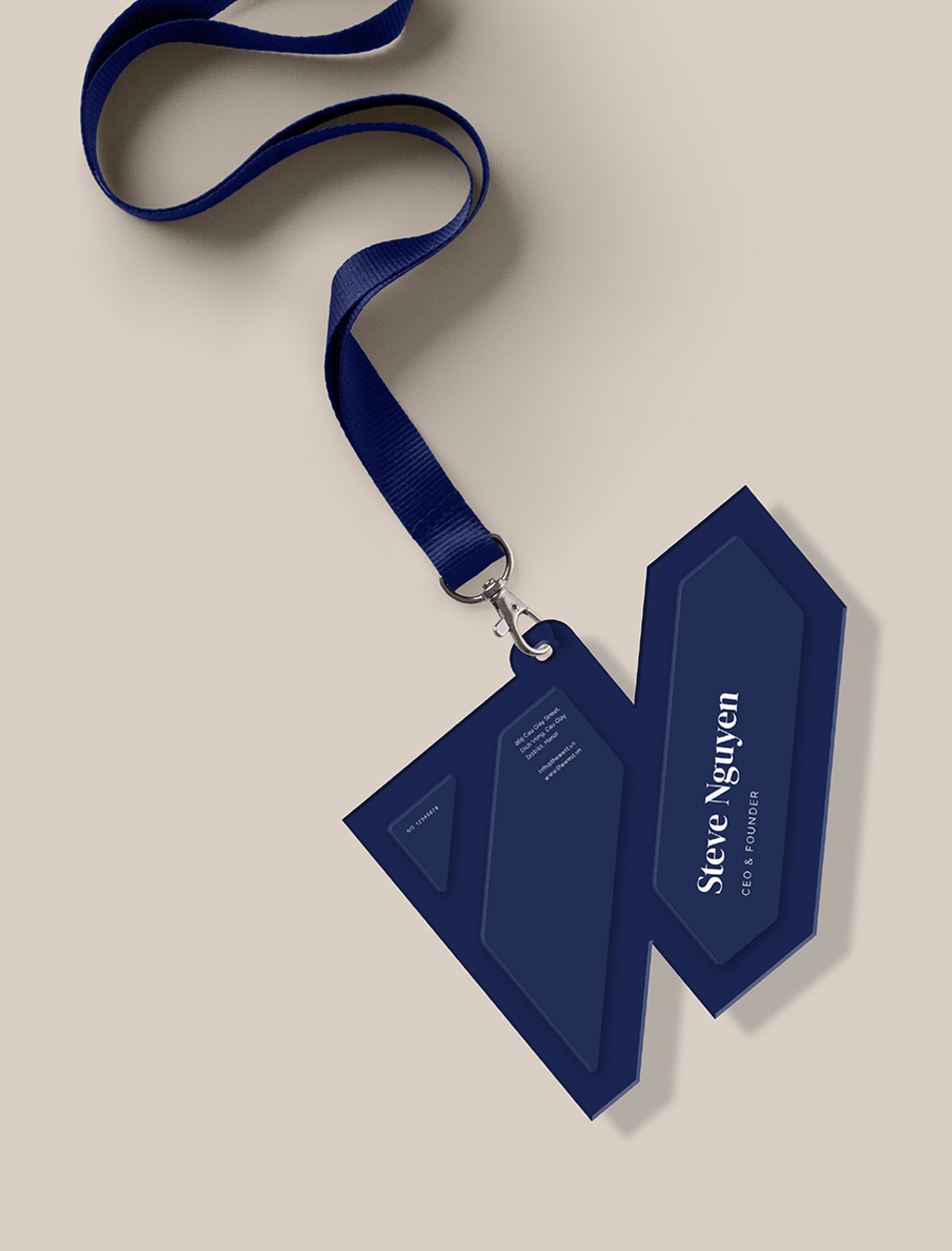
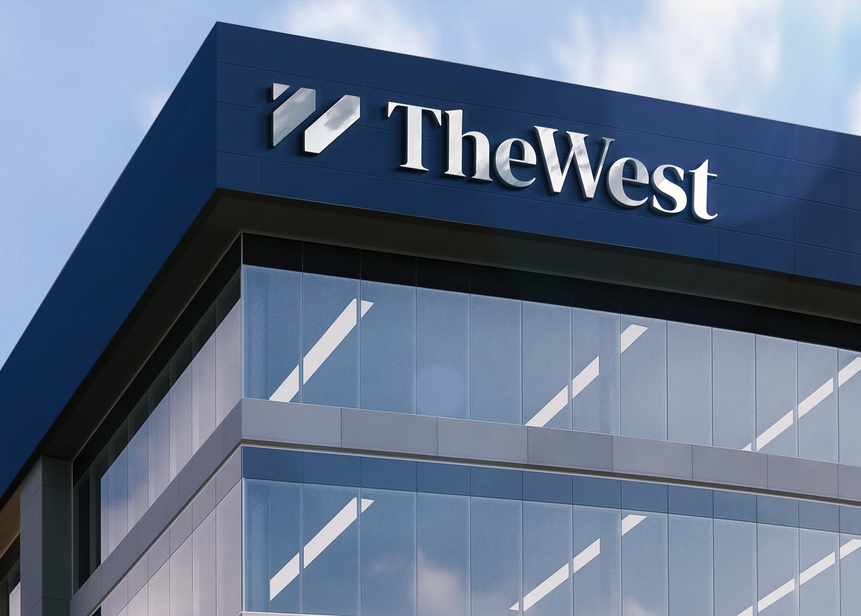
The mark carries the same logic into a single shape. It reads first as a W. Inside it, an arrow points west. And in the negative space between the strokes sits a T so the building’s initial, its direction, and its name all live in the same handful of lines.
Client The West
Location Vietnam
Scope Office tower branding · Brand identity · Logo design · Custom wordmark
Sector Commercial property and office development branding